Joie Luxe Rentals
Brand identity · Luxury real estate
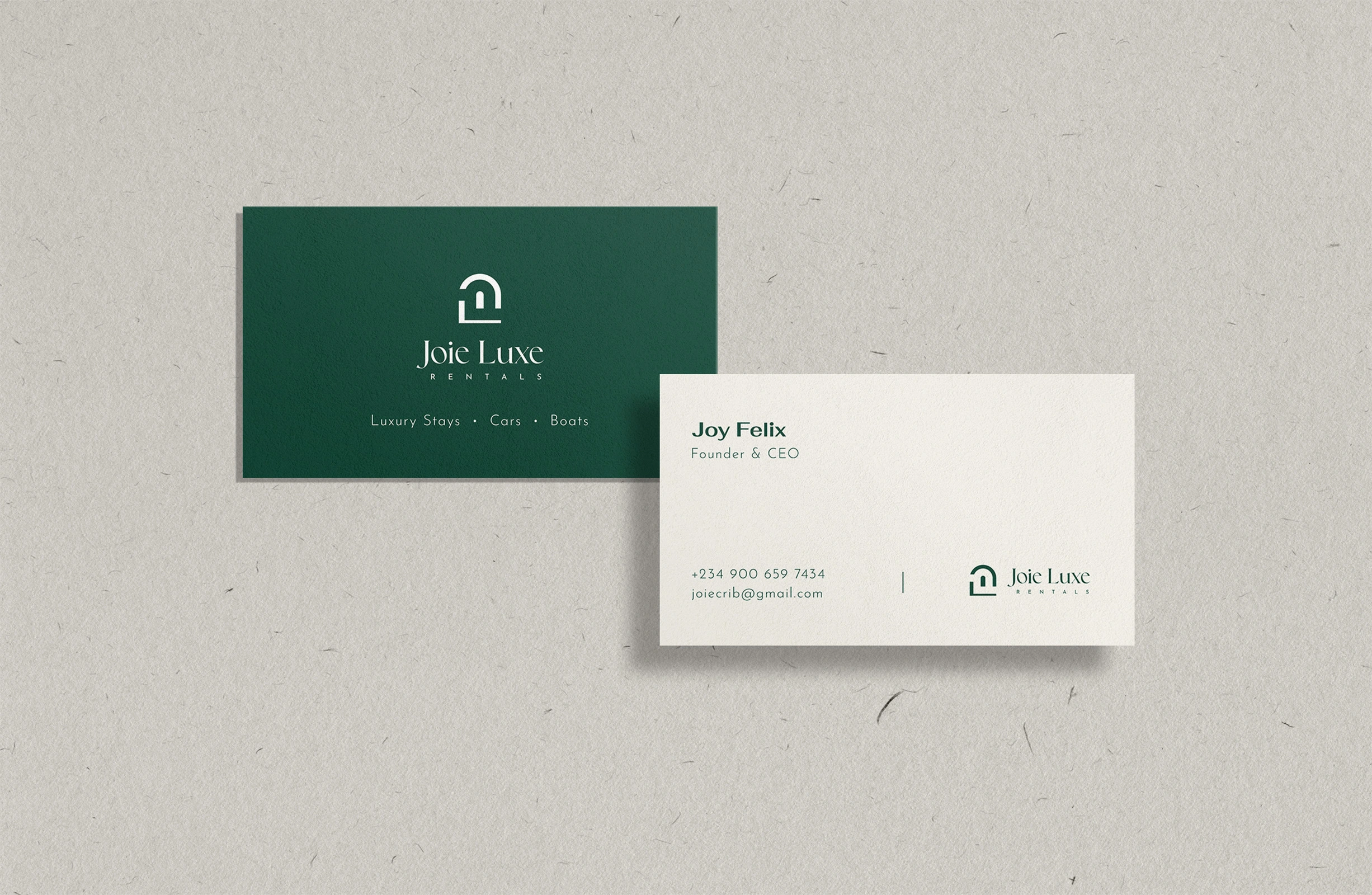
The founder came to me for a new logo. In our discovery call, I found the real problem: Joie Luxe rents premium apartments in Lekki, but it was drawing inquiries from people who couldn’t afford them.
Its social presence explained why. Holiday clipart, stock scenery, a different typeface in every post and a house-and-car icon all said budget agency. The apartments were luxury; the brand around them wasn’t.

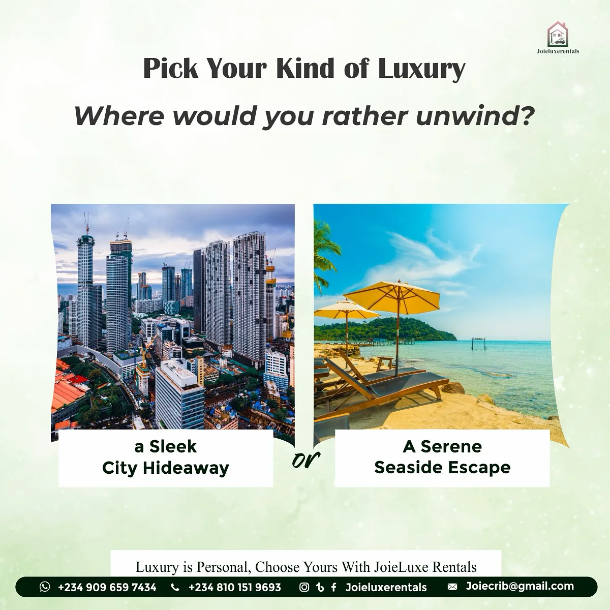

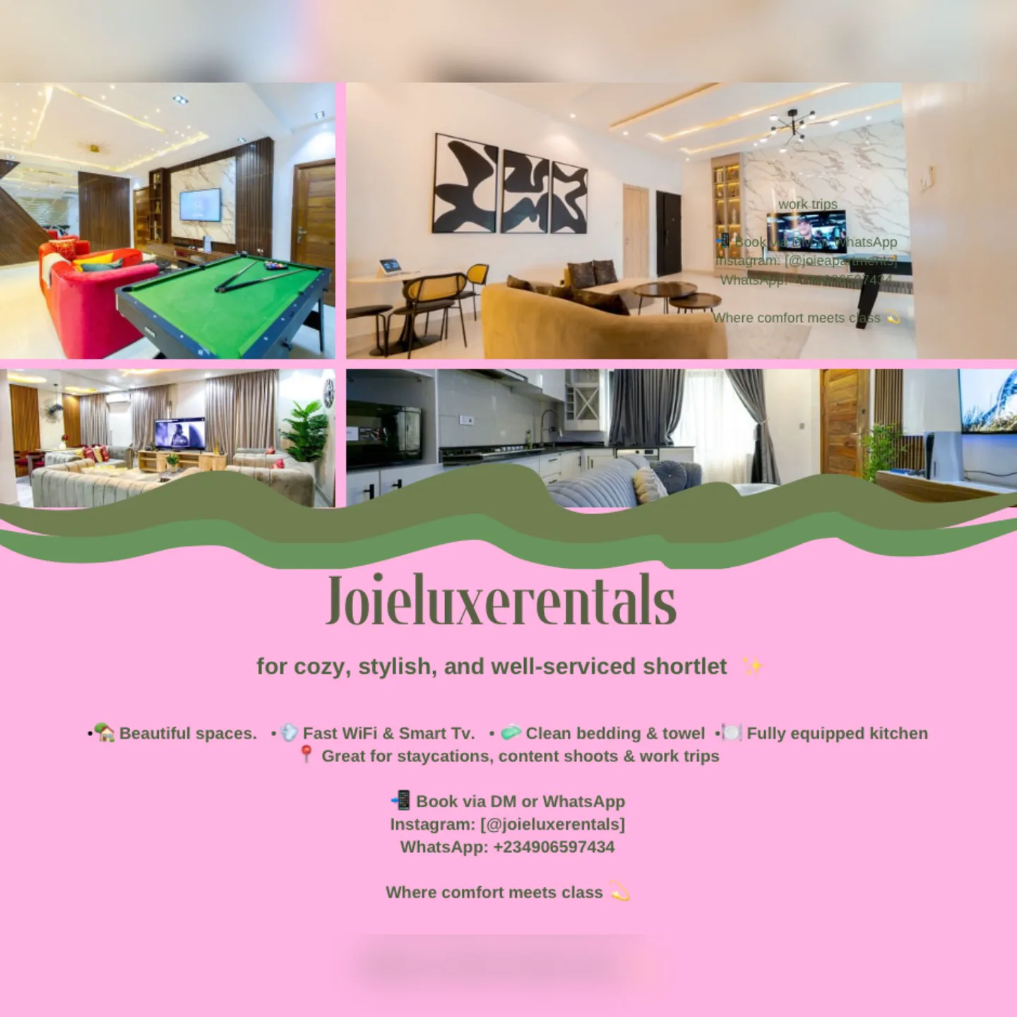
Before: Joie Luxe on Instagram
The new identity had to close that gap, so the right clients could recognise the standard before they ever asked the price.
Before sketching, I studied what luxury actually communicates: Rolex, Patek Philippe, Aman. Aman stood out most, with its quiet photography and how little it says, and it became the north star for Joie Luxe.
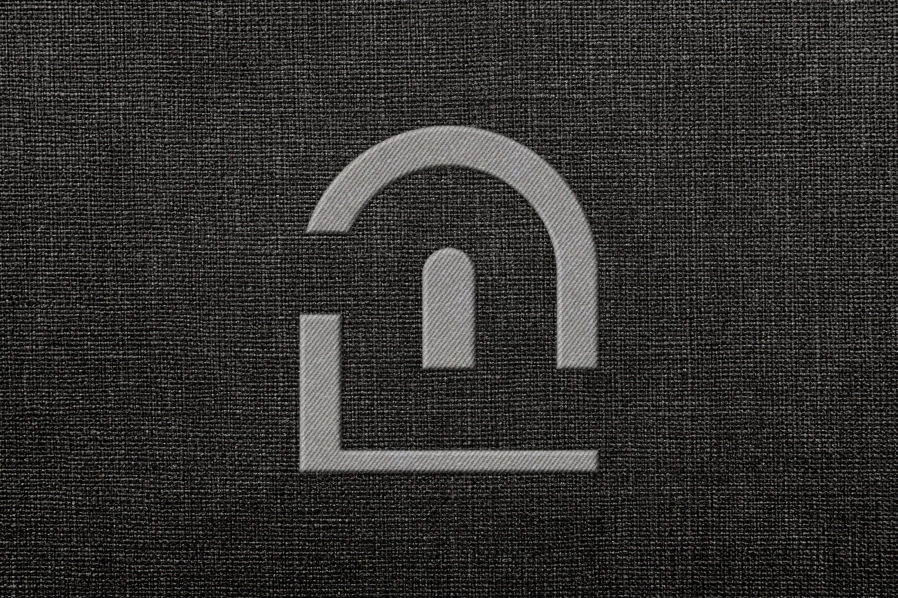
The research turned up one shape again and again: across the luxury apartments I studied, the arch kept recurring, and Joie Luxe’s own apartments carried it too. The mark joins that arch with the initials J and L. Then I tested it from building signage down to a clothing tag.
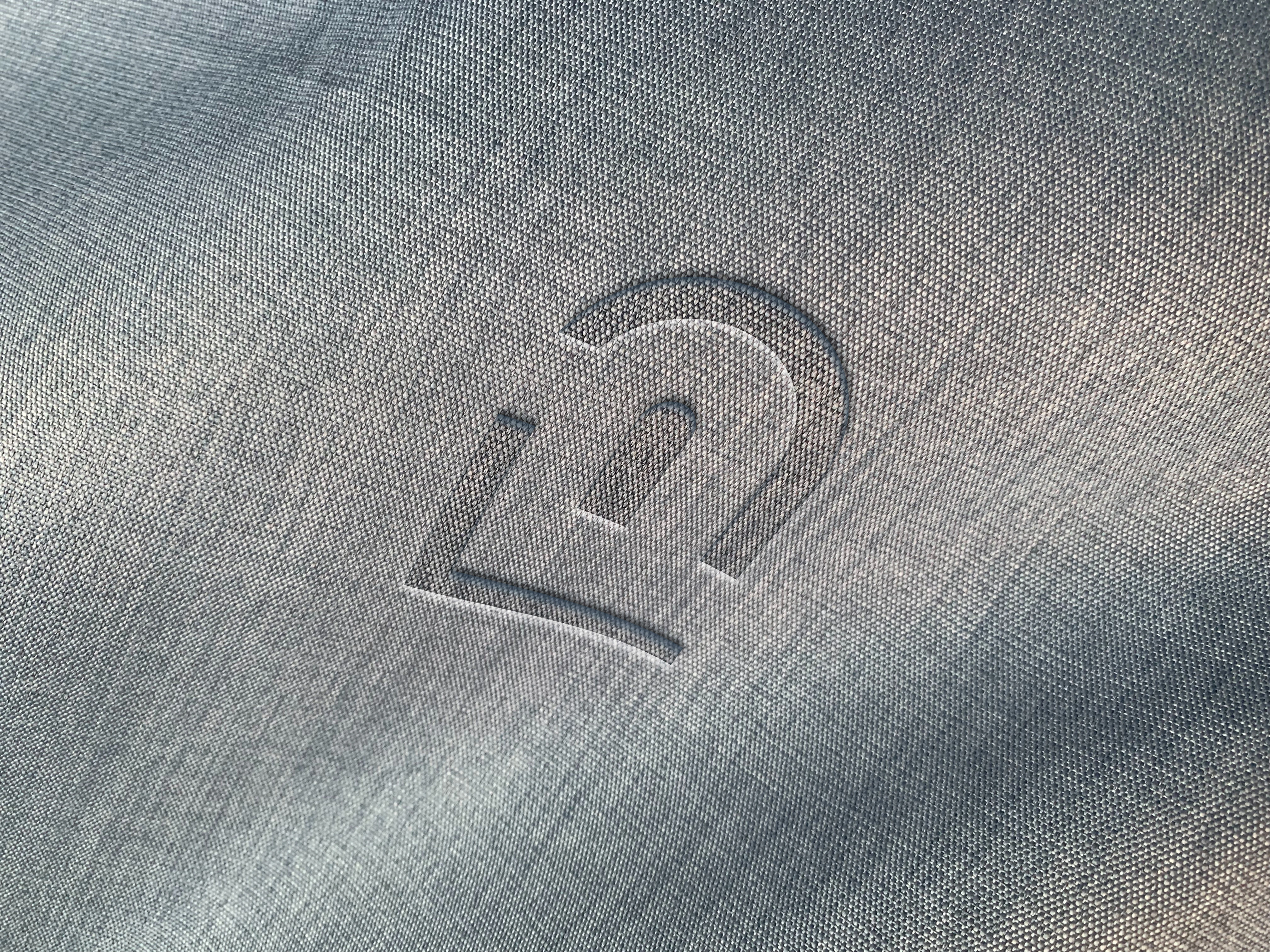
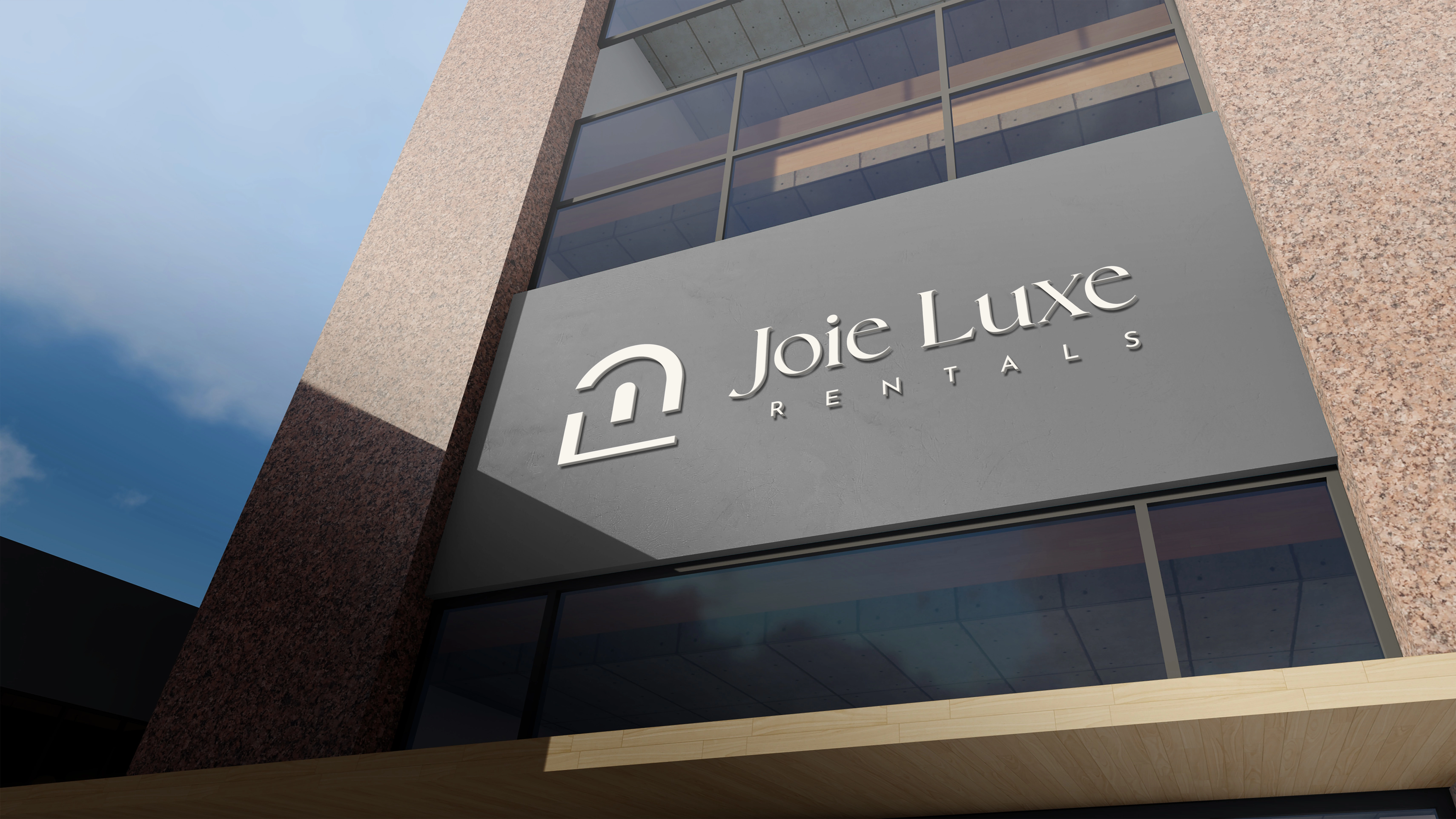
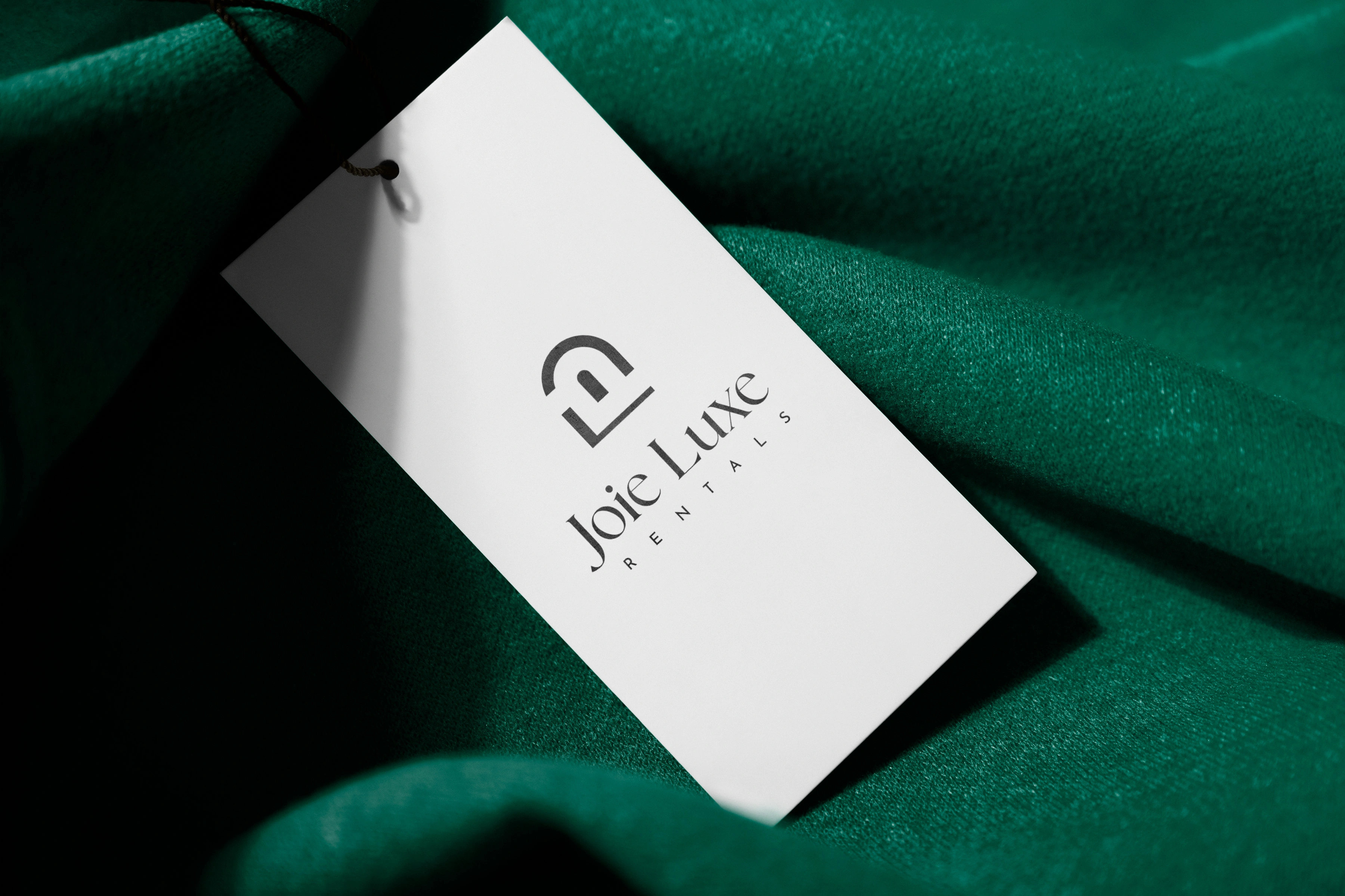
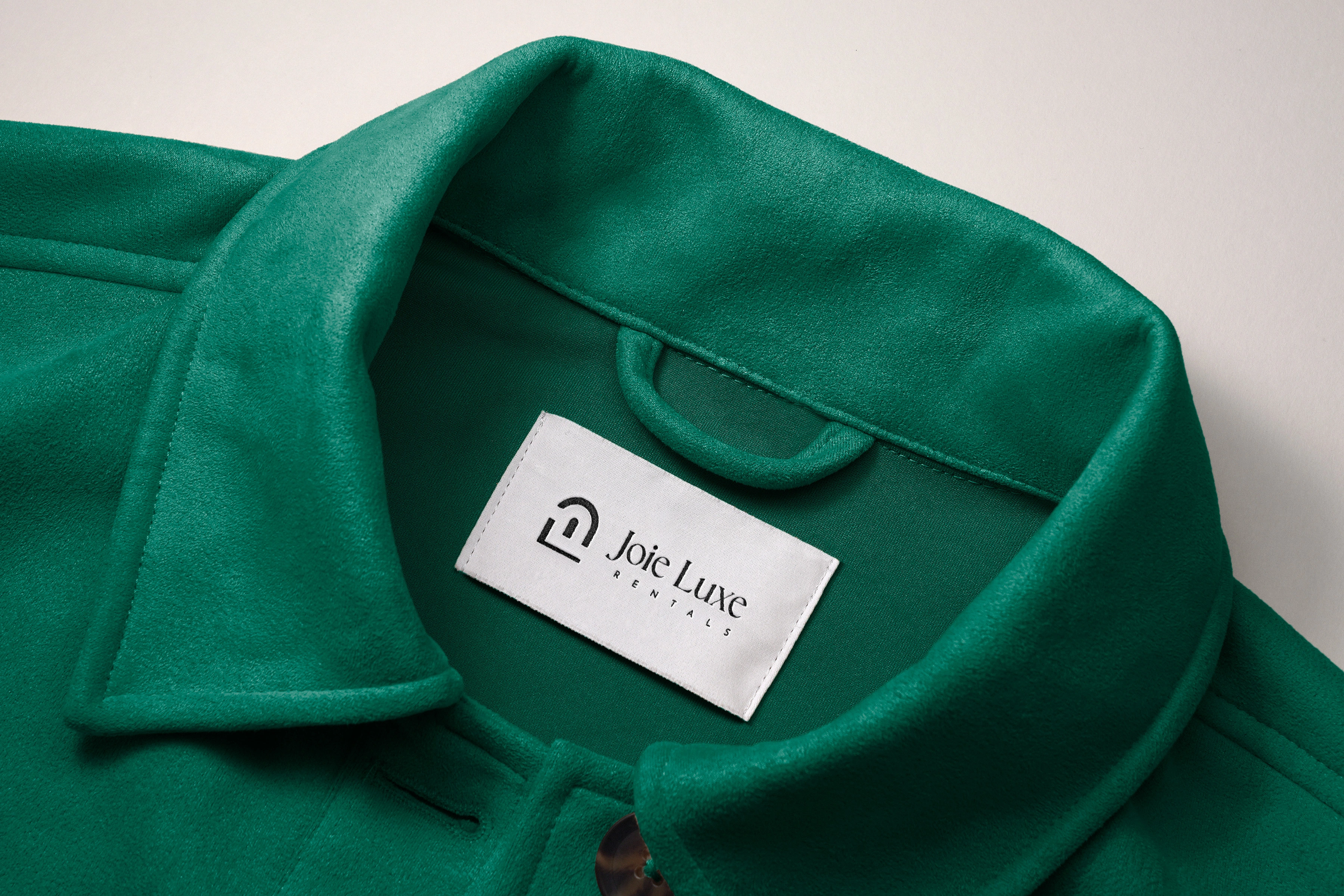
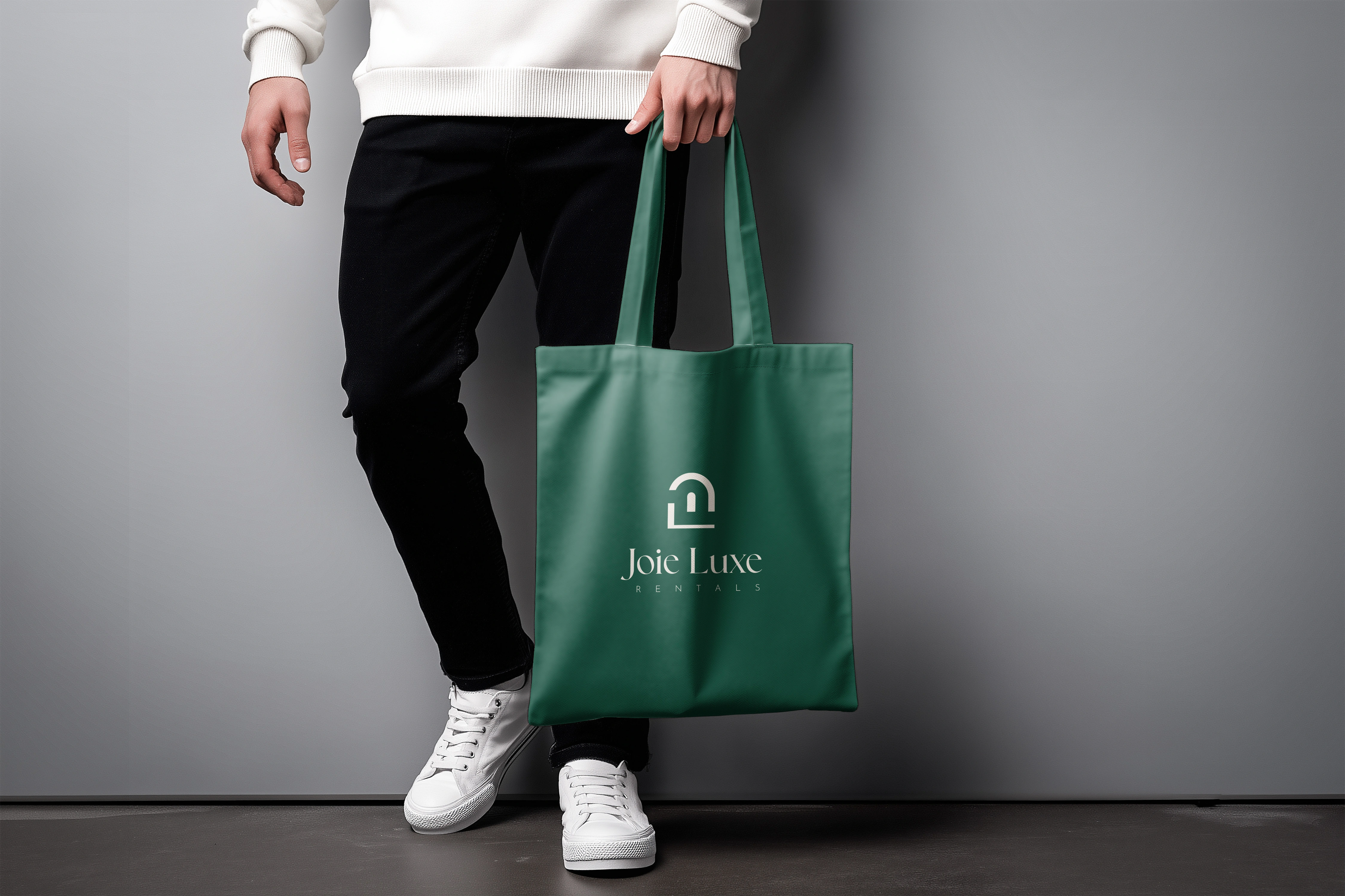
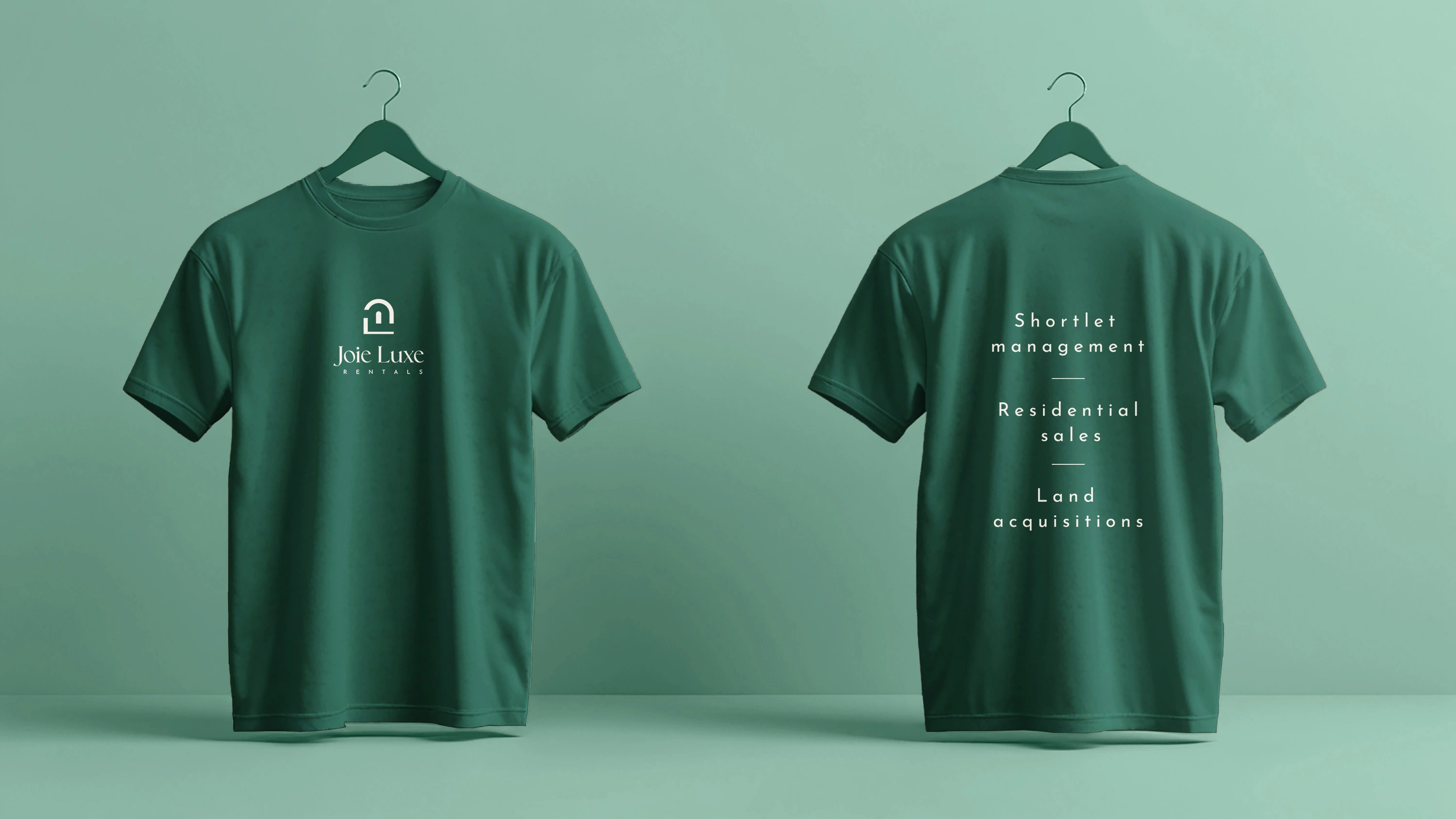
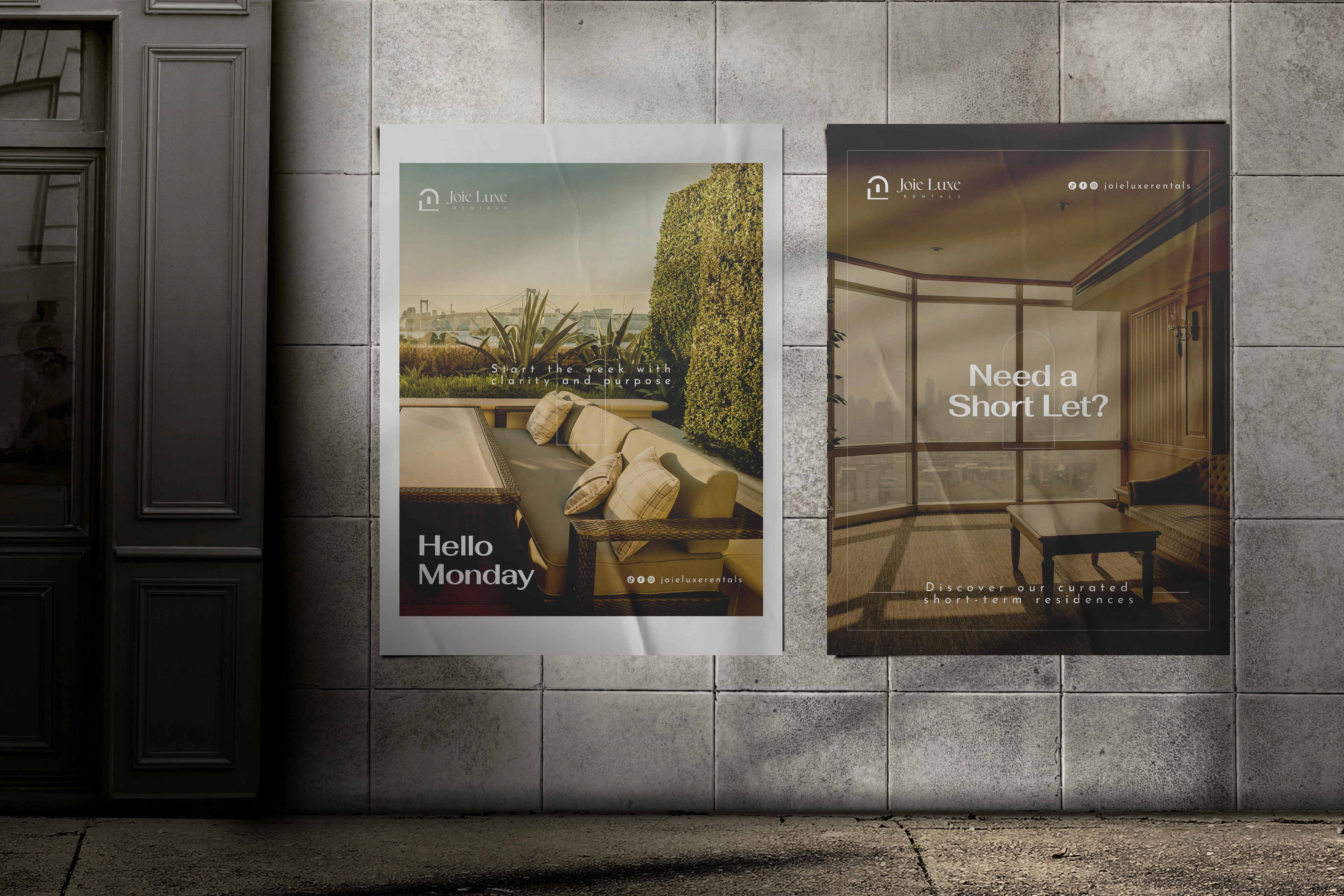
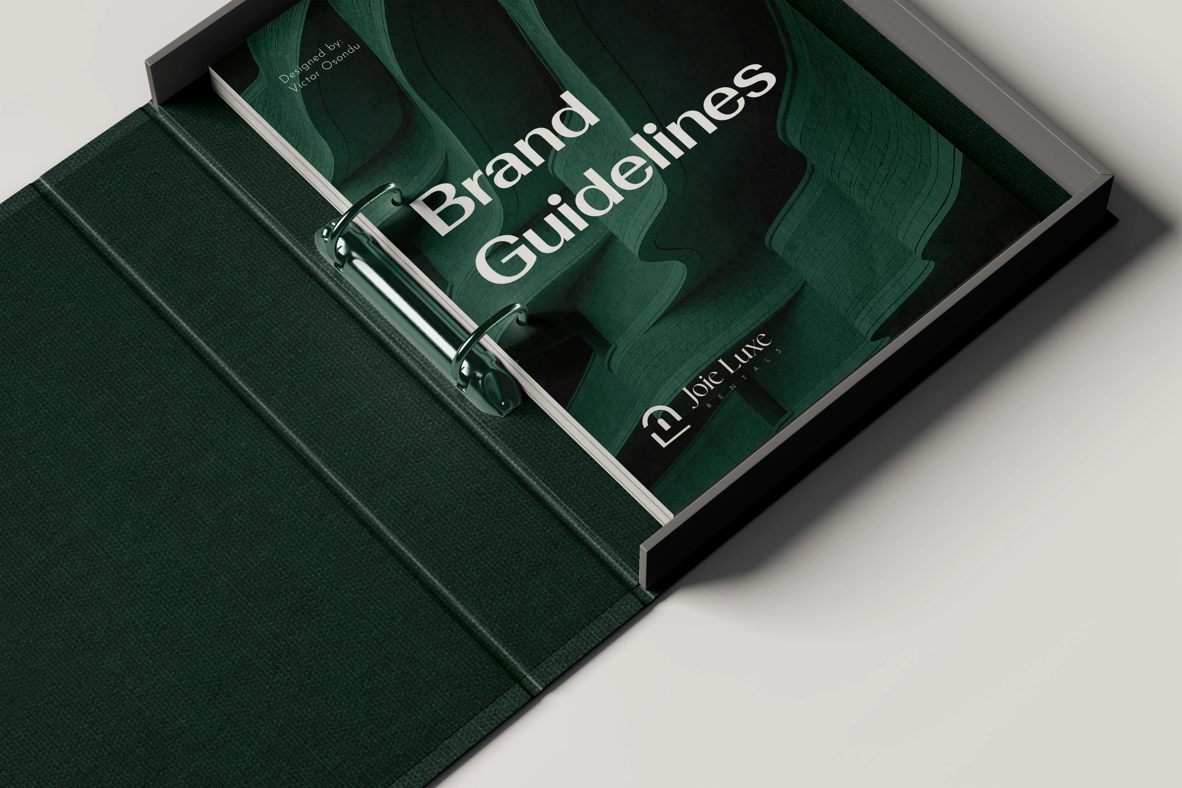
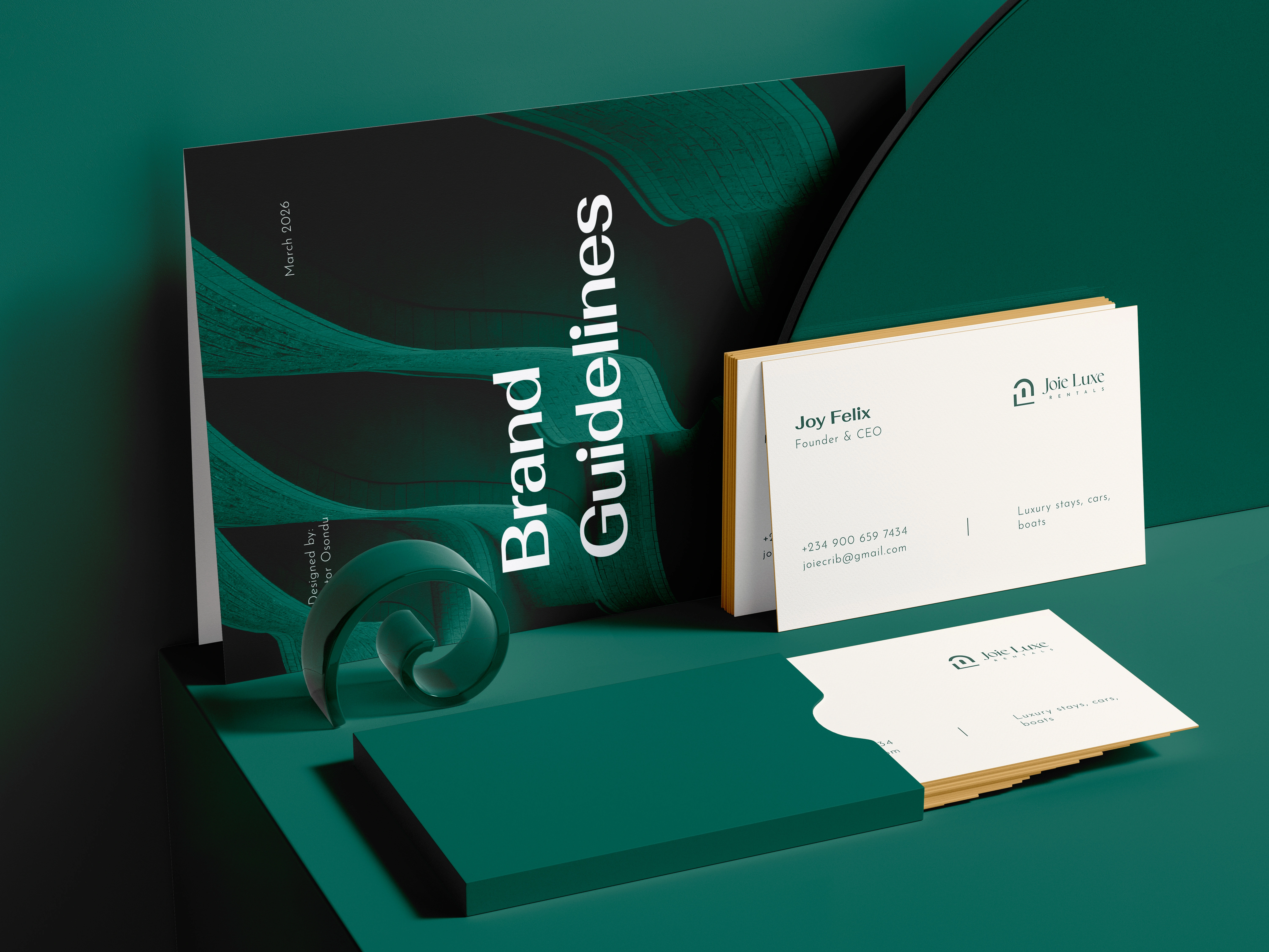
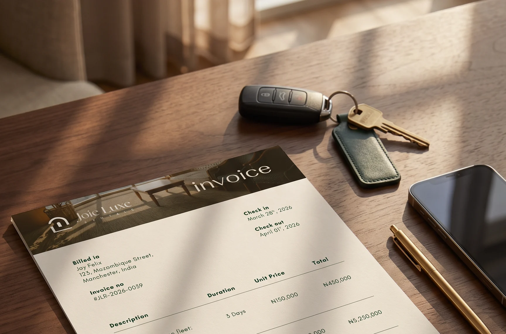
After seeing the identity, the founder expanded the project beyond the logo: merchandise, invoice and receipt templates, and social media designs.
It’s still too early to say whether the right clients are coming through the door. An identity only works if it’s used consistently, and that’s taught me to build more rollout support into every project.
“The result was fabulous, the exact premium branding and feel I needed. Victor listened to my expectations patiently and delivered exactly what I wanted. I’m sticking with his services, and I’ve already referred him.”