BWBCON 2026
Event branding · 2026

Early on, I was torn between leaning into the blockchain side of BWBCON or the community side. The blockchain world was already full of tech-forward events that all looked alike: blue, sharp, futuristic.
What made BWBCON different was who it was for: doctors, engineers, lawyers, economists, petty traders and students. It existed to answer the question of the everyday person who has heard of blockchain tech: how does this affect me?
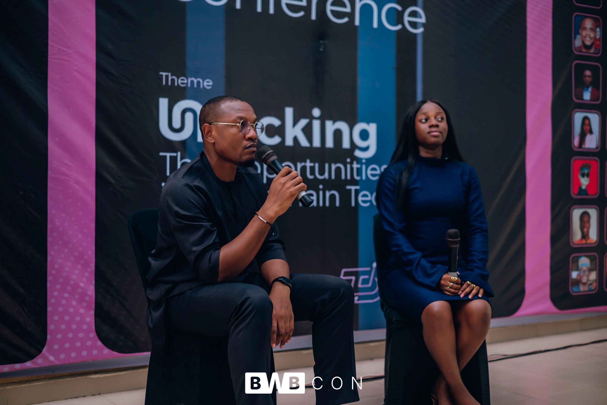
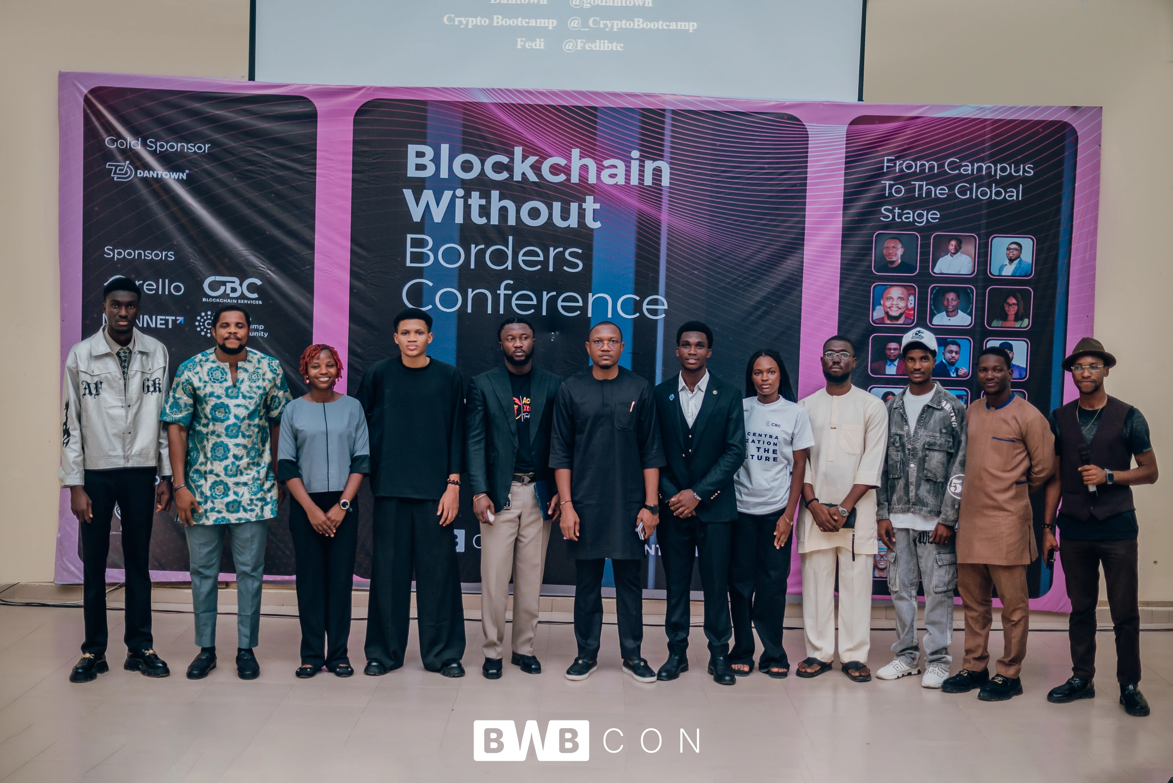
So I chose the community side. Purple, because it’s inviting and stands out in a market dominated by blue. And rounded corners on the logomark, after the sharp-edged version I first sketched felt less welcoming to the people it was meant to invite in.