Brand Identity · Strategy · 2025
BOA Zerah
Brand Identity · Strategy · 2025
Overview
BOA Zerah is a multi-sector enterprise launched in 2025 and based in Lagos, Nigeria. The goal was to position BOA Zerah as a key investor across the trade, energy, production, and supply chain sectors, highlighting its commitment to true innovation and real diversity.
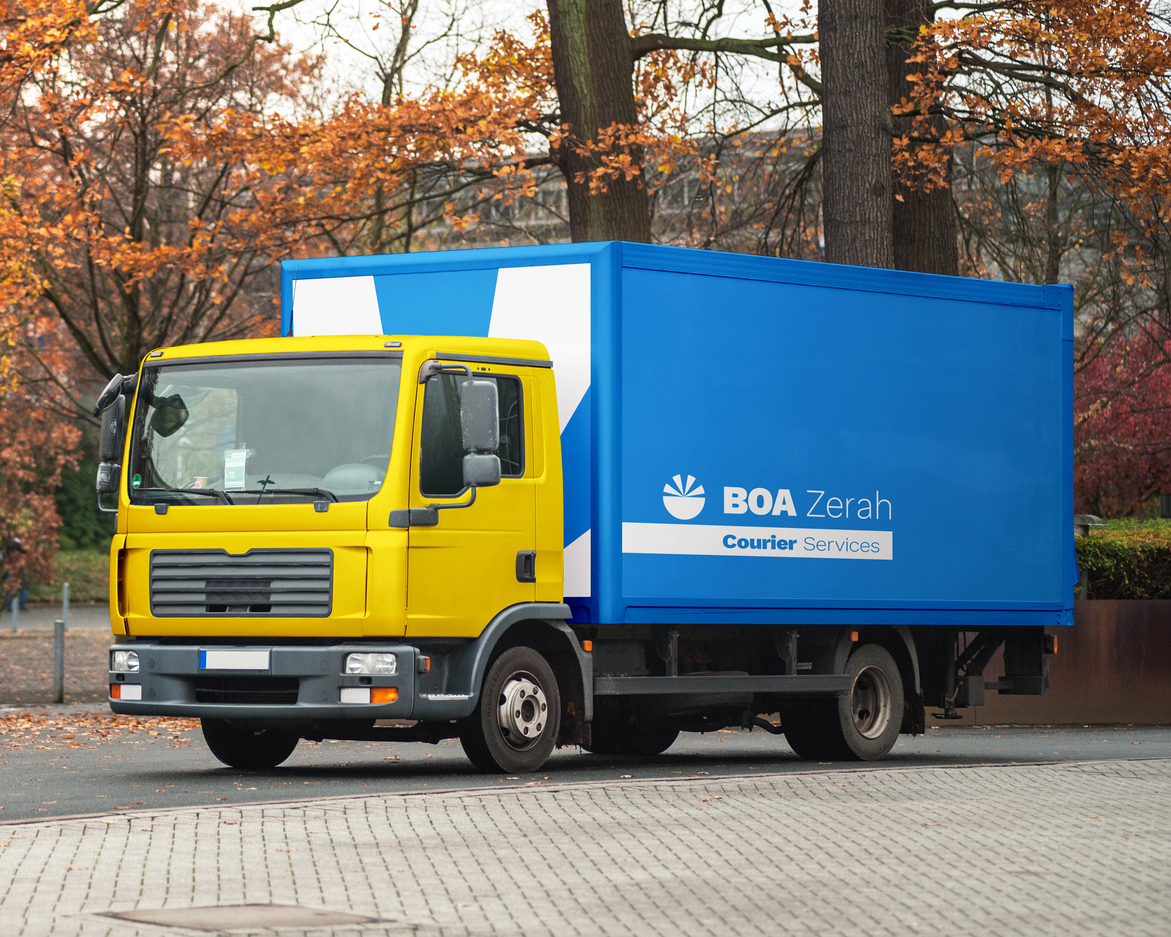
The identity needed to feel authoritative enough to command boardroom confidence, yet versatile enough to flex across wildly different industries without losing coherence.
The logo
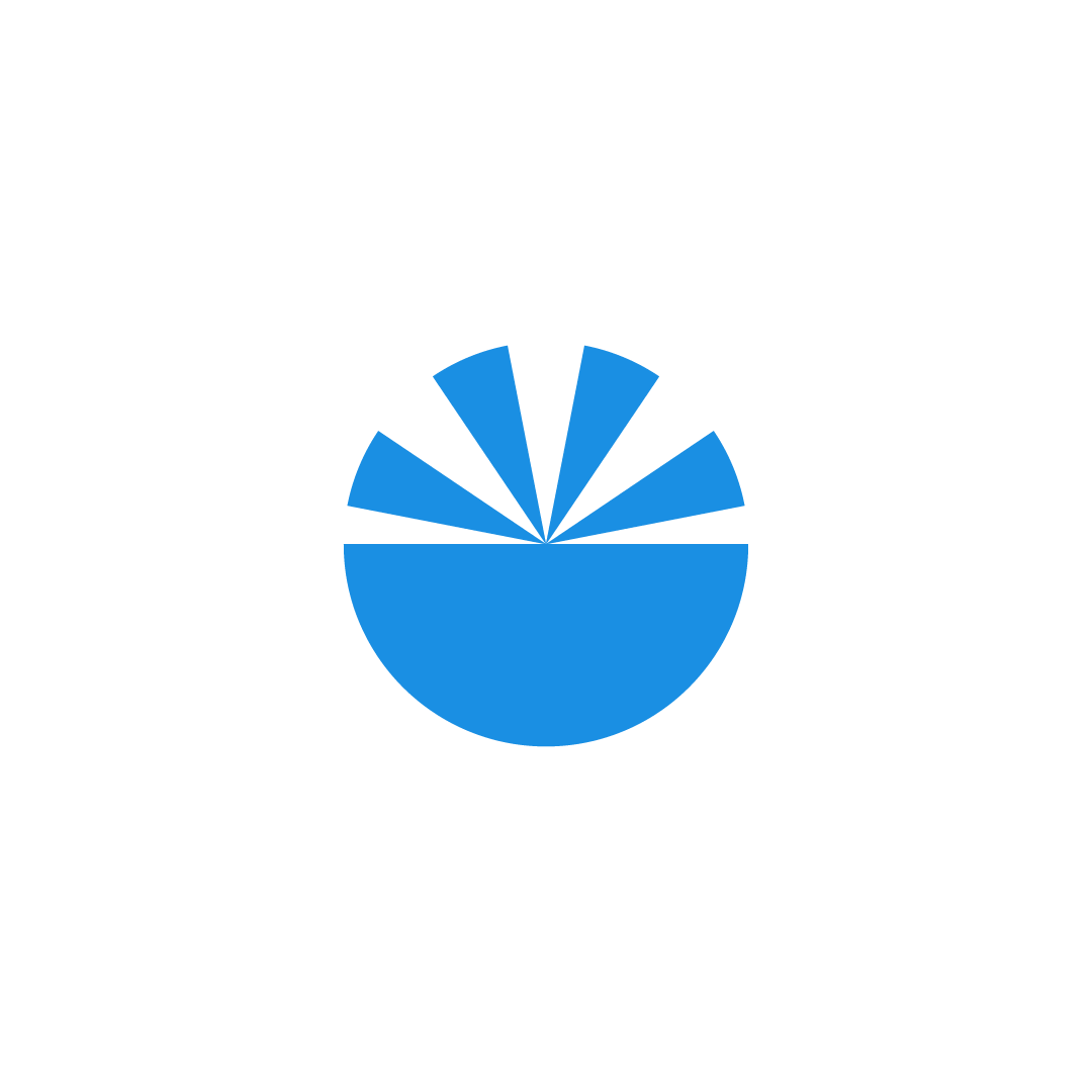

Logo concept
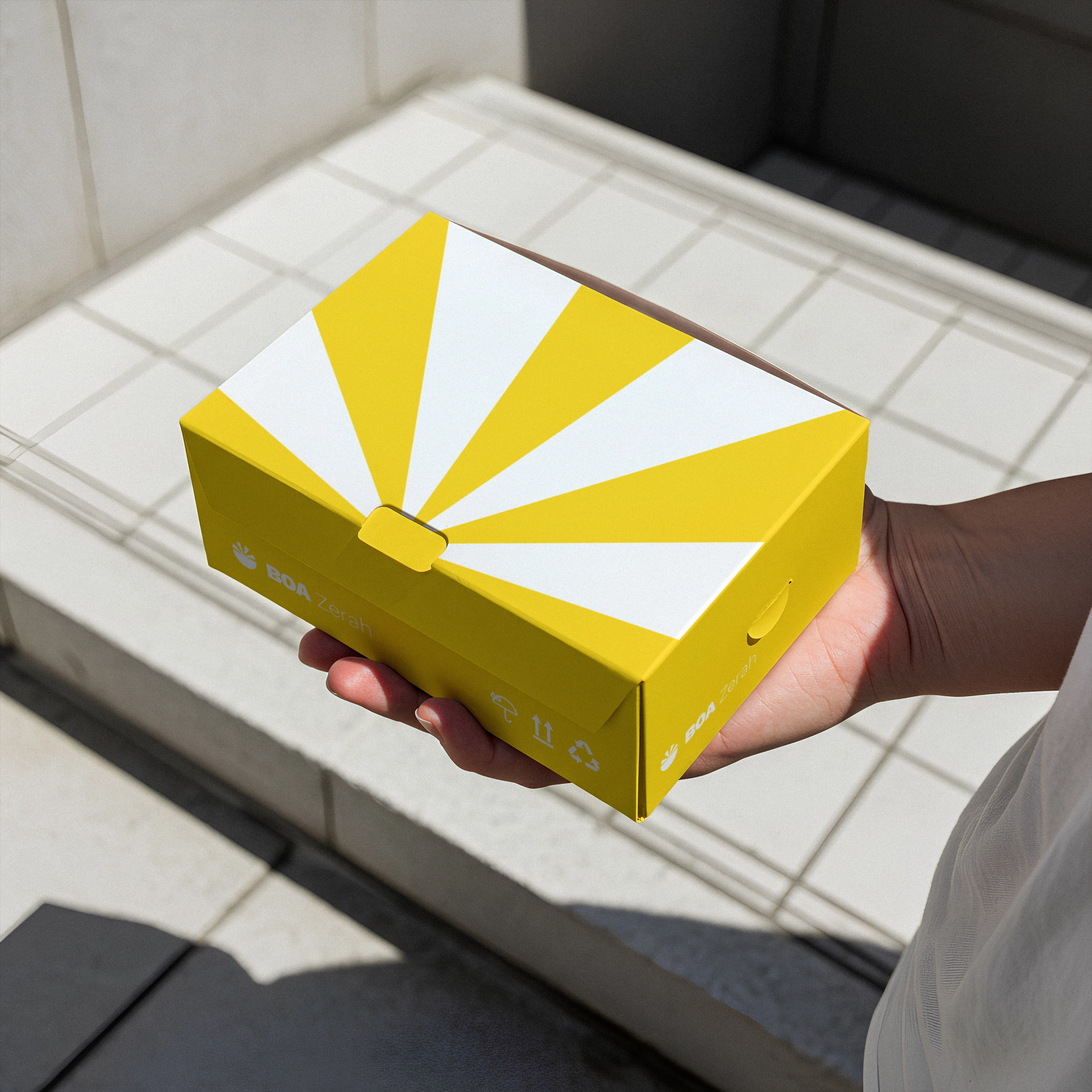
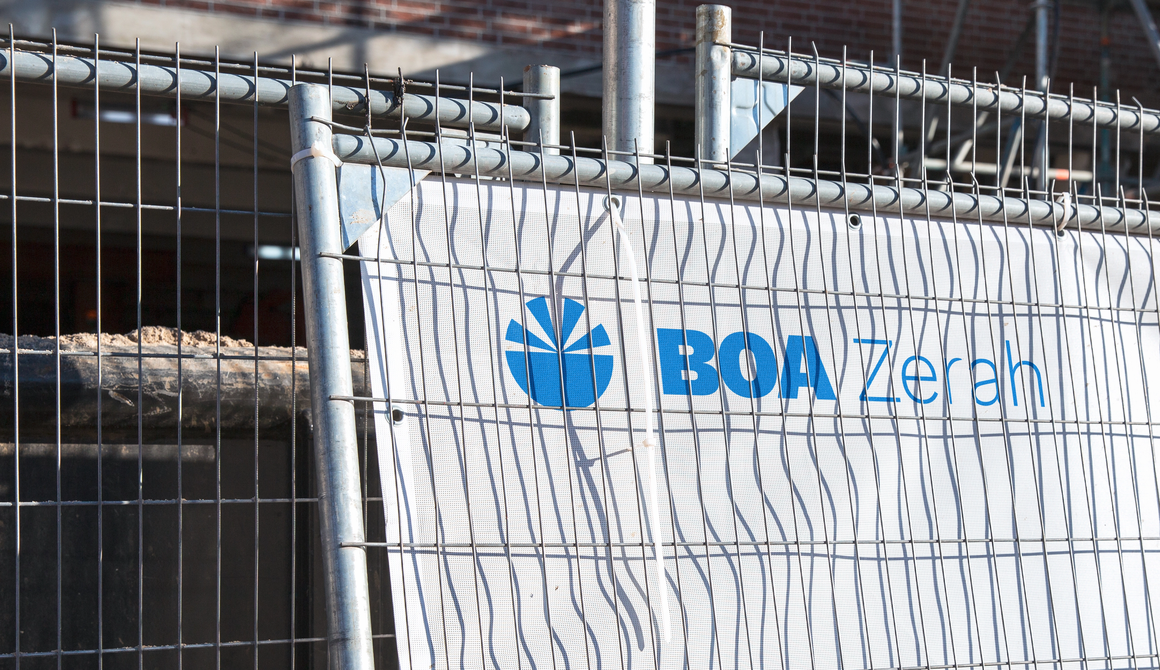
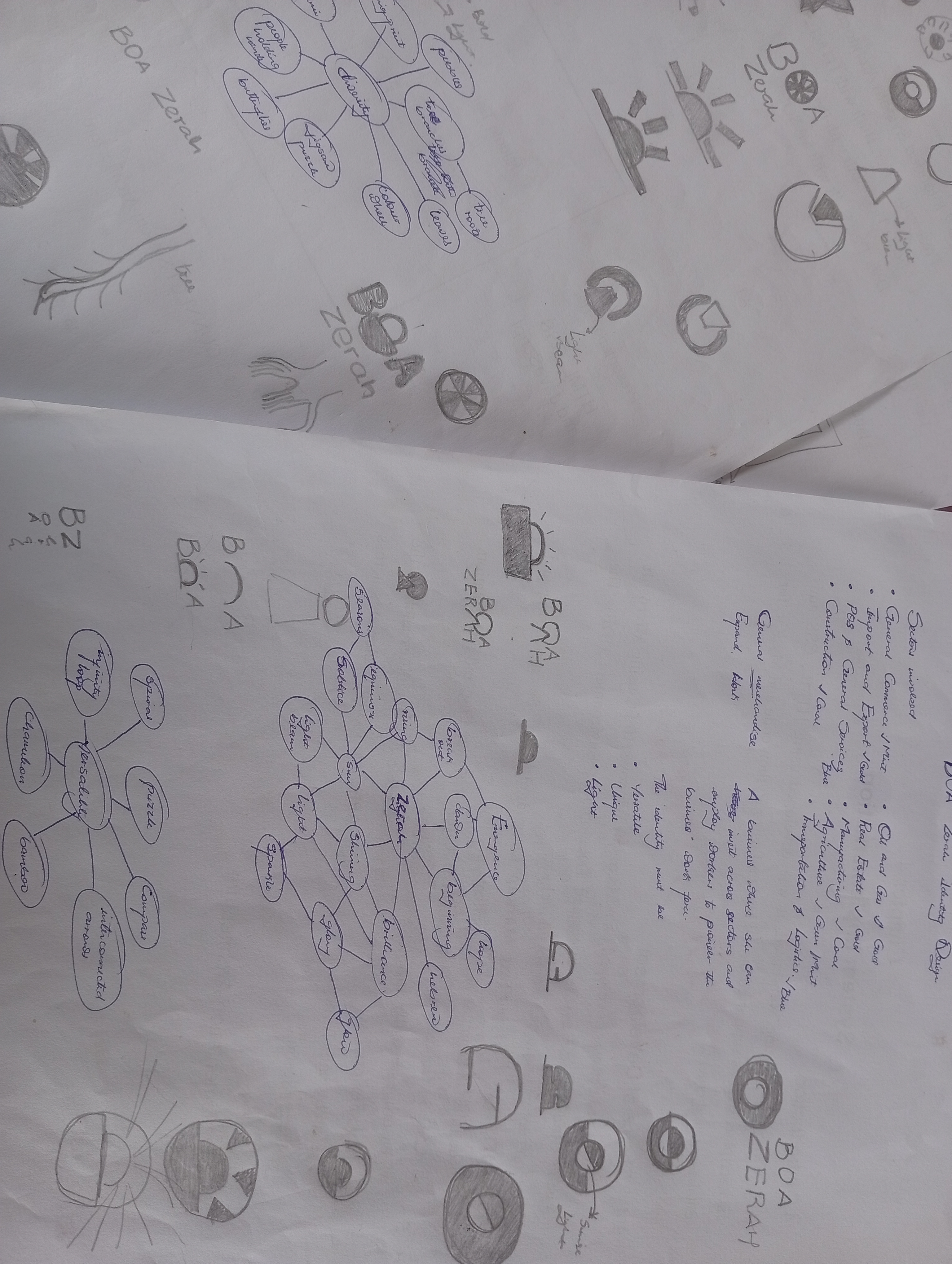
"Zerah" is a Hebrew word meaning shining. The divergent rays in the mark reflect the brand's diverse and versatile vision, energy radiating outward into multiple sectors simultaneously.
The semi-circle beneath hints at the world of business and opportunity. Its clean, simple form is designed to adapt seamlessly across the many fields BOA Zerah operates in, equally at home on a corporate letterhead as on a hard hat or shipping container.
Brand colours
The colour palette is designed to capture BOA Zerah's core values of diversity, versatility, and brilliance. Each hue works together to reflect the brand's wide-ranging vision and adaptability, no single colour dominates, just as no single sector defines the business.

Mockups