Rebrand · Identity System · Practice Project
Addide Rebrand

Rebrand · Identity System · Practice Project
Overview
Addide is one of Nigeria's fastest-growing convenience store chains, built on neighbourhood accessibility and a customer-centred approach. They've grown rapidly across Lagos, offering everyday essentials with a reputation for convenience and affordability.
"Growing up in Ikorodu, my family had a tradition of buying our Sunday refreshments from the Addide store near us, even when there were closer options."
This practice project was a brand refresh for my childhood convenience store. Personal history made the brief more meaningful, and the brief was clear: modernise the identity while keeping the warmth and accessibility that made Addide a neighbourhood staple.
Strategy
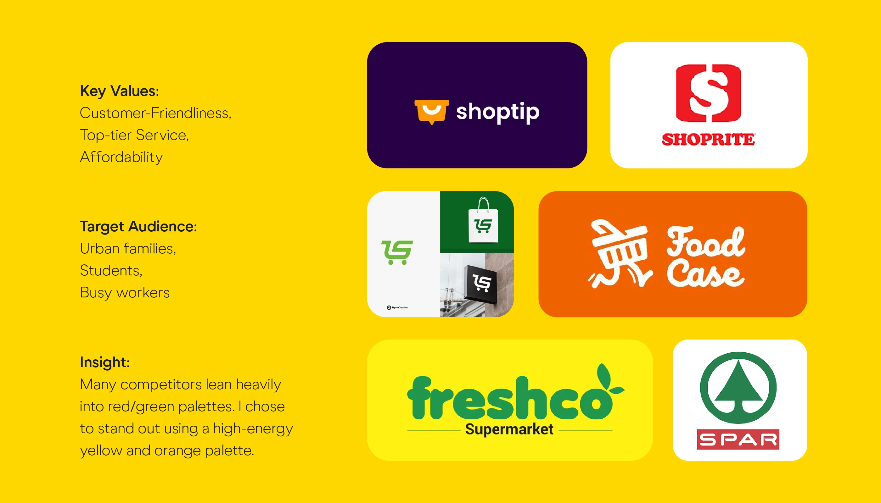
The rebrand needed to honour Addide's existing brand equity, the 'a' everyone recognises, while bringing a sharper, more contemporary edge. The new identity system had to work across storefront signage, packaging, staff uniforms, and digital touchpoints.
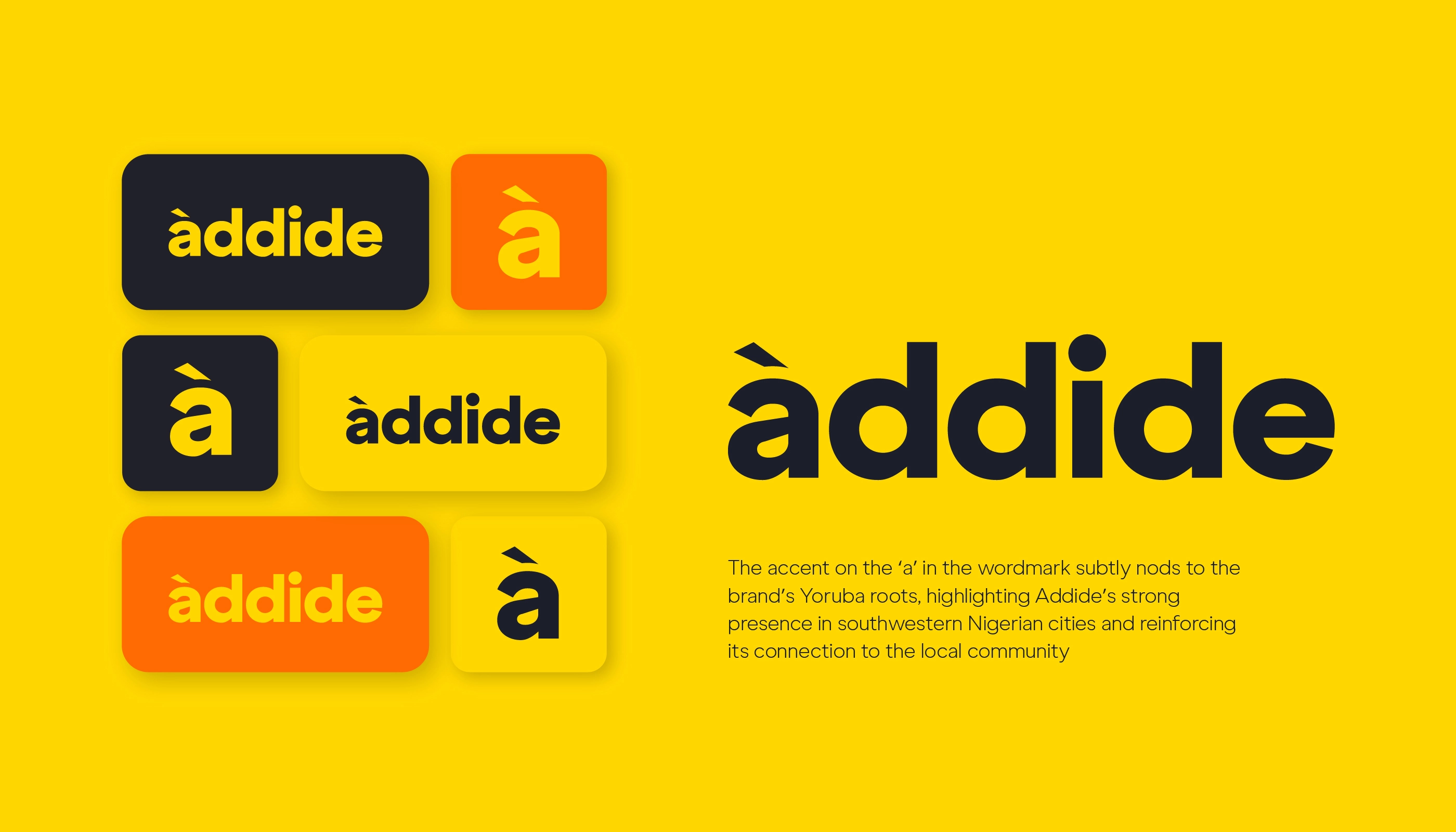
The logo was the focal point. The original mark on their storefront always bothered me. The refresh introduced a cleaner, more confident letterform, one that feels designed rather than defaulted to.
Colour & Typography
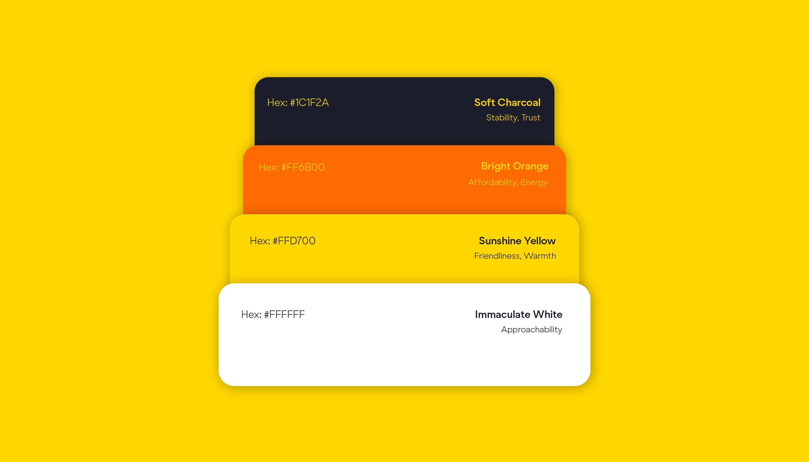
Yellow became the hero, bold, energetic, and sure to be embedded in public memory. It was paired with a deep black and a warm orange accent to add depth without losing the immediacy Addide is known for.
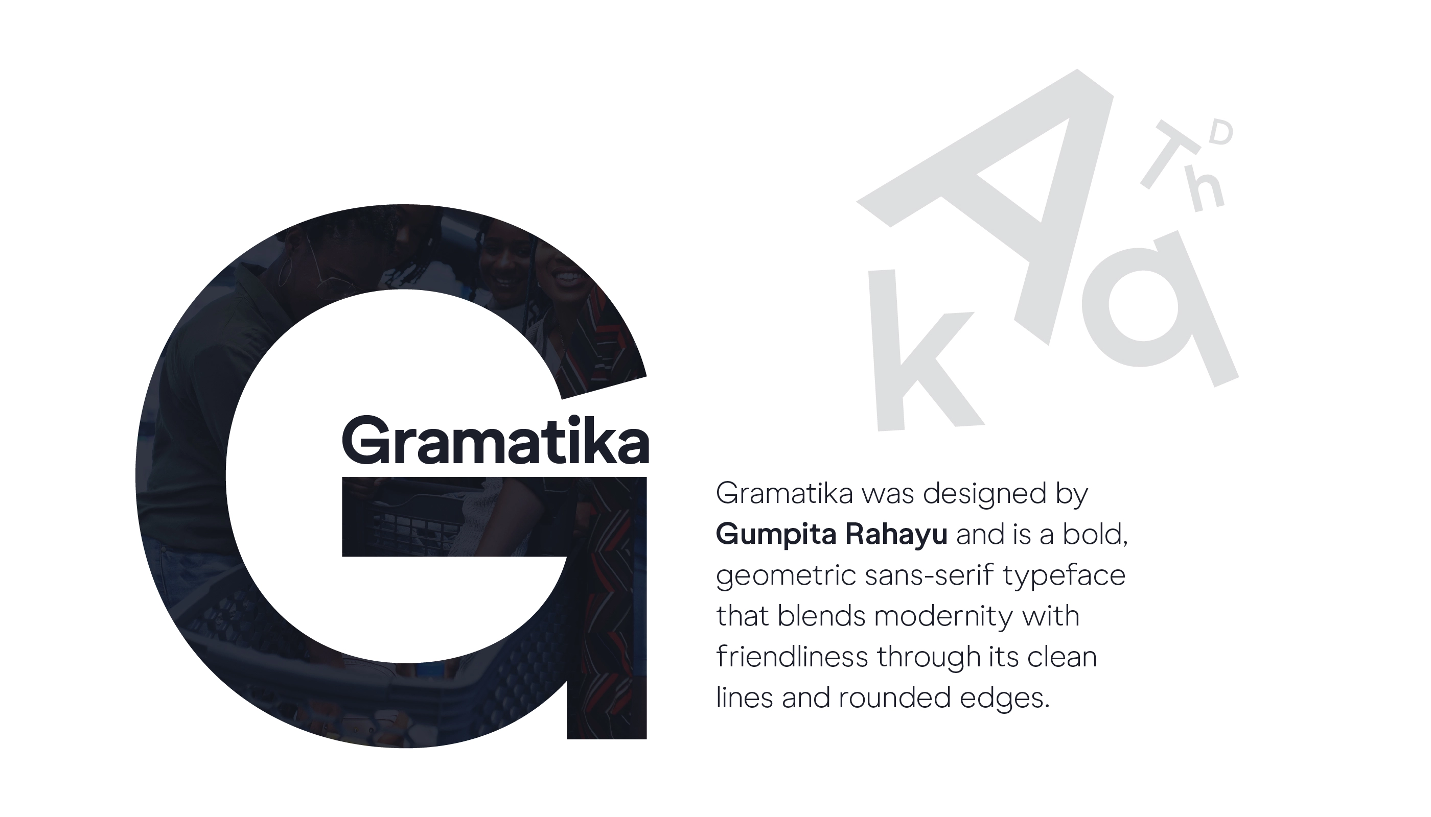
Typography was selected to balance friendliness with clarity. Gramatika was chosen for its strong, geometric character, a typeface confident enough to anchor a storefront and legible enough to work at small sizes on packaging.
Mockups
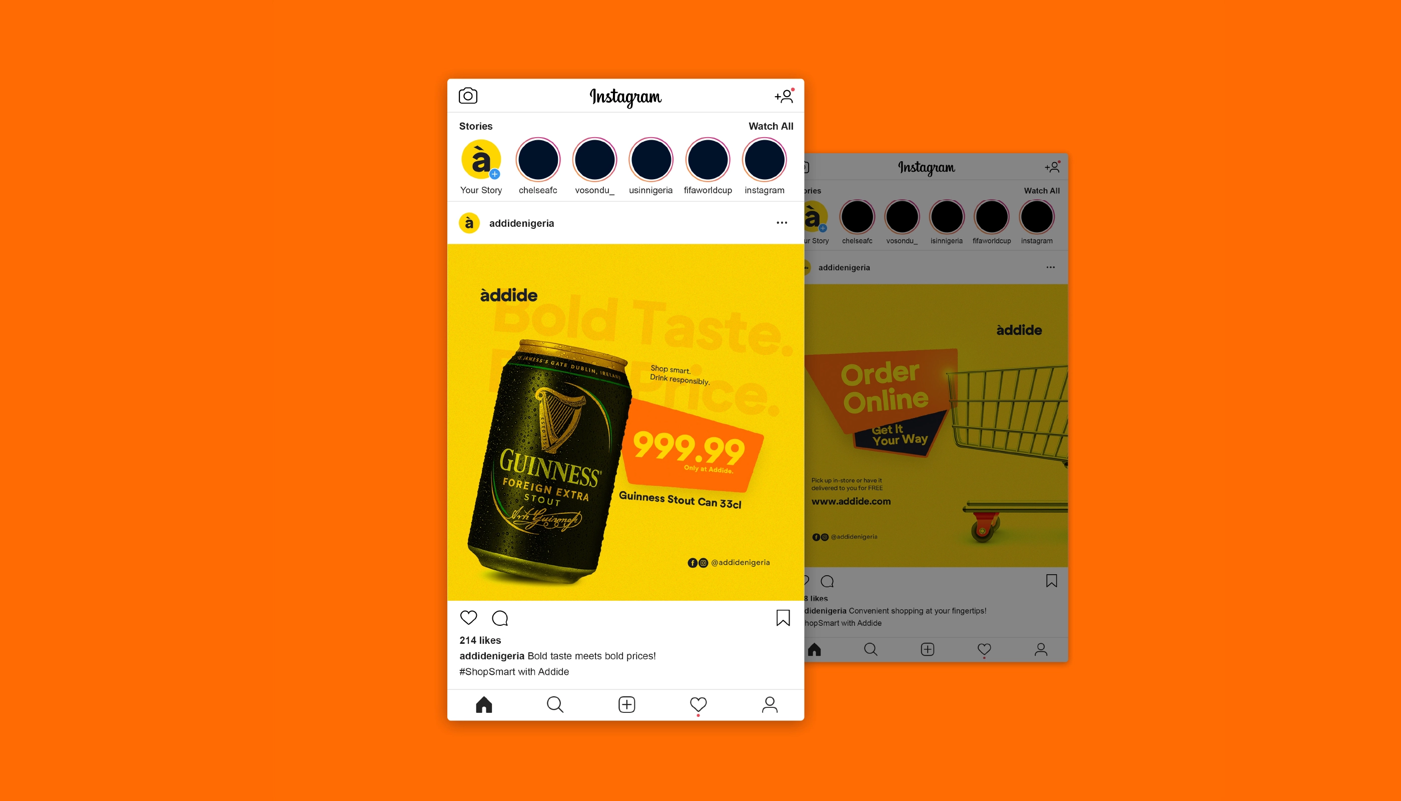
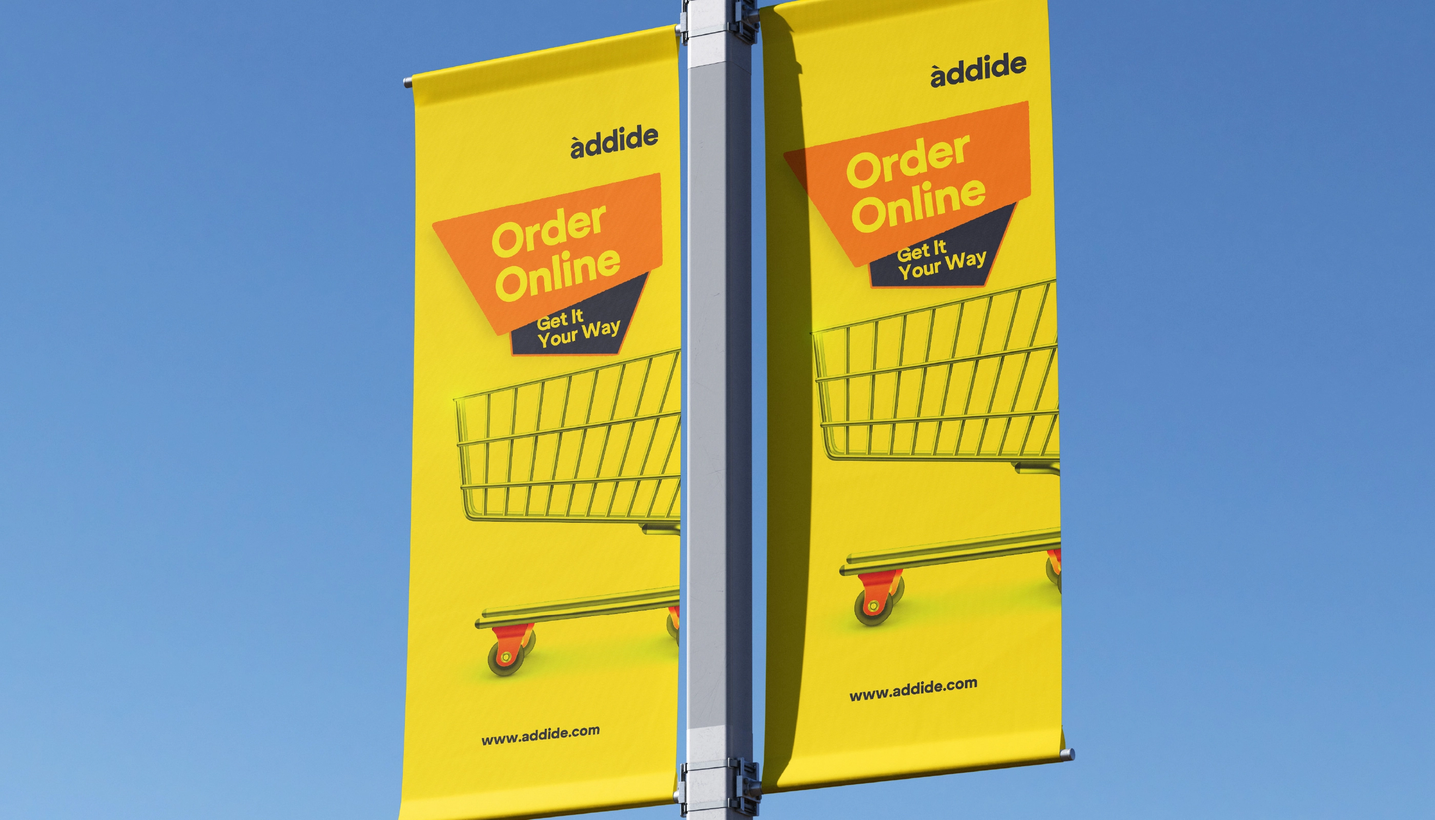
The rebrand was applied across key brand touchpoints, stationery, packaging, outdoor signage, digital interfaces, and merchandise. Every application tested whether the identity could hold its own across radically different contexts.