Komi’s Kitchen
Food brand · Brand identity
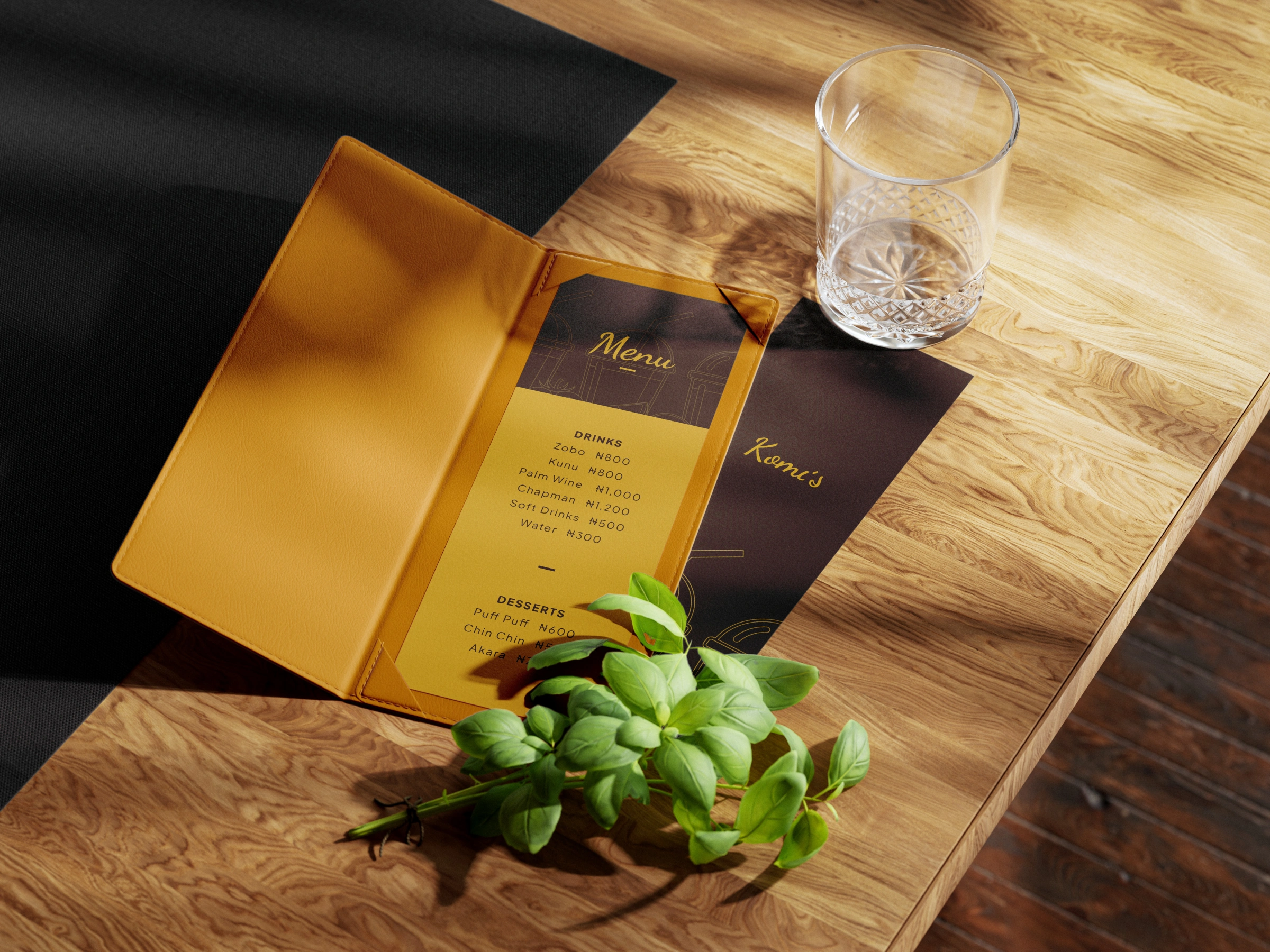
Komi’s Kitchen didn’t start as a business. It started as a nickname.
Komi had always been the one cooking at home in the village, but never took it seriously. Then came Lagos, and staying with a sister who started calling every meal “Komi’s kitchen.” The family were the ones who said: you can actually do this.
From the moment we unpacked that story in discovery, I knew the identity had to carry pieces of it. Komi never trained as a chef. The cooking came from home, and the promise was simple:
“Any time you come to our restaurant to eat... you’ll literally get this flashback of the home meal you’ve been missing.”
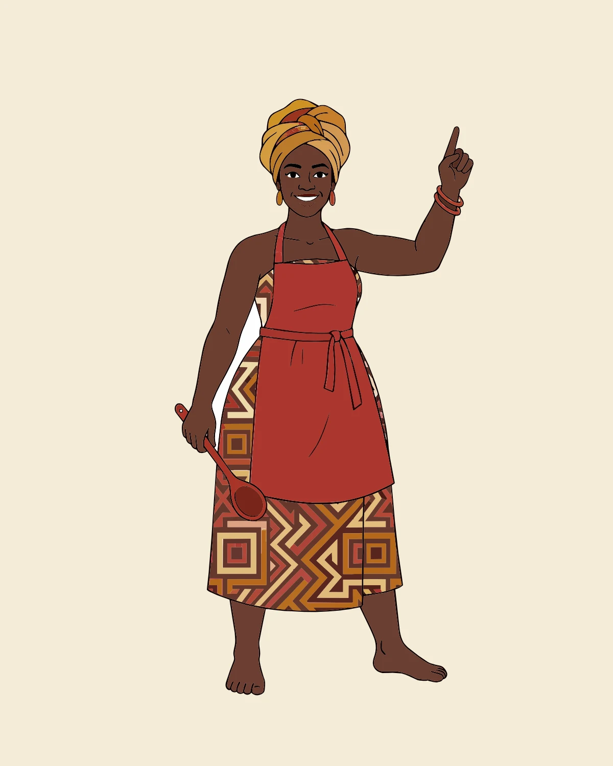
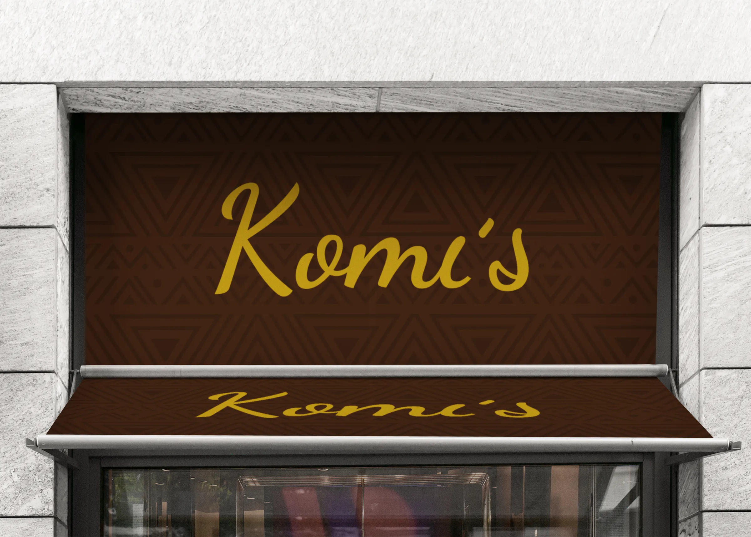
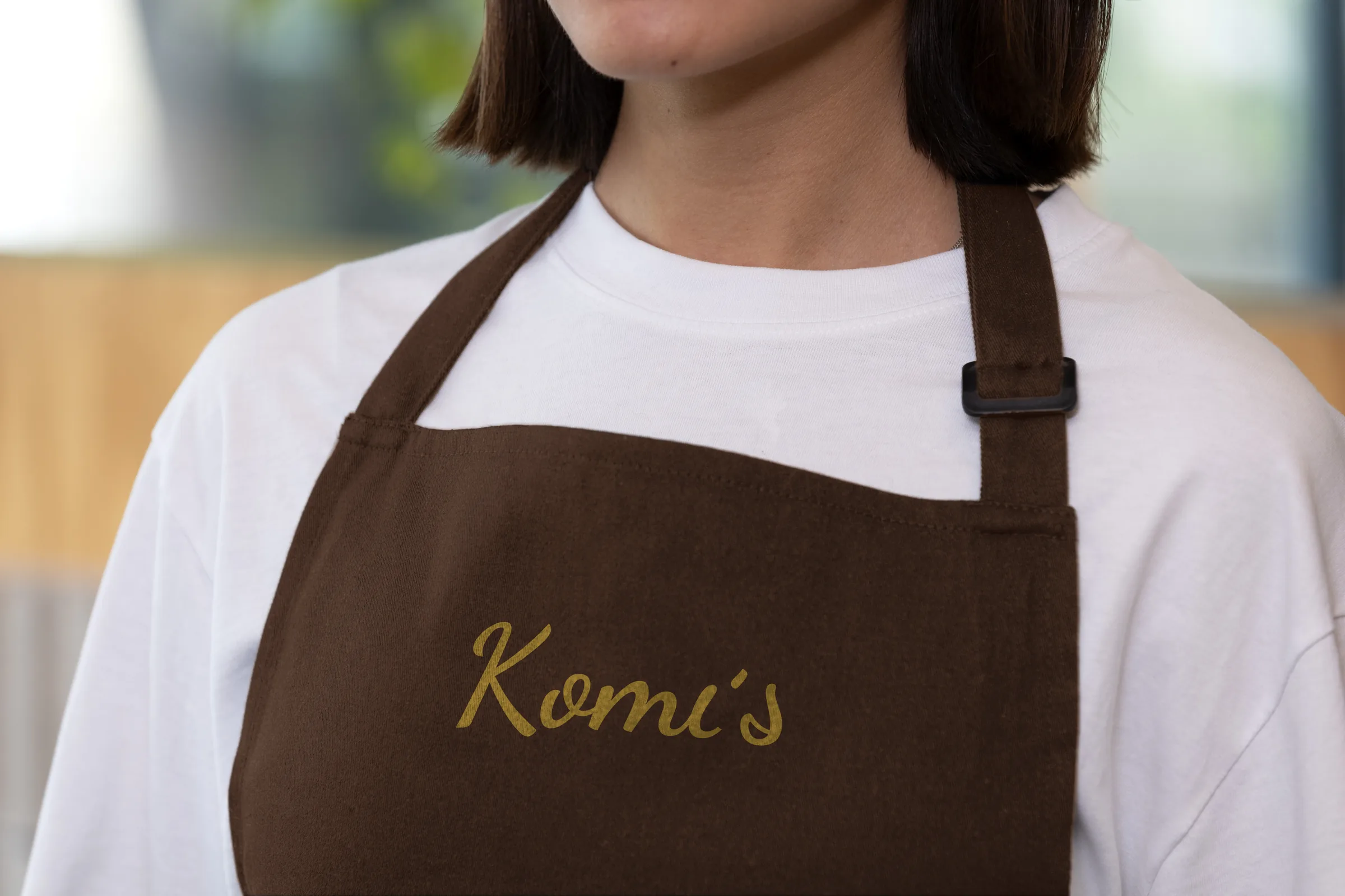
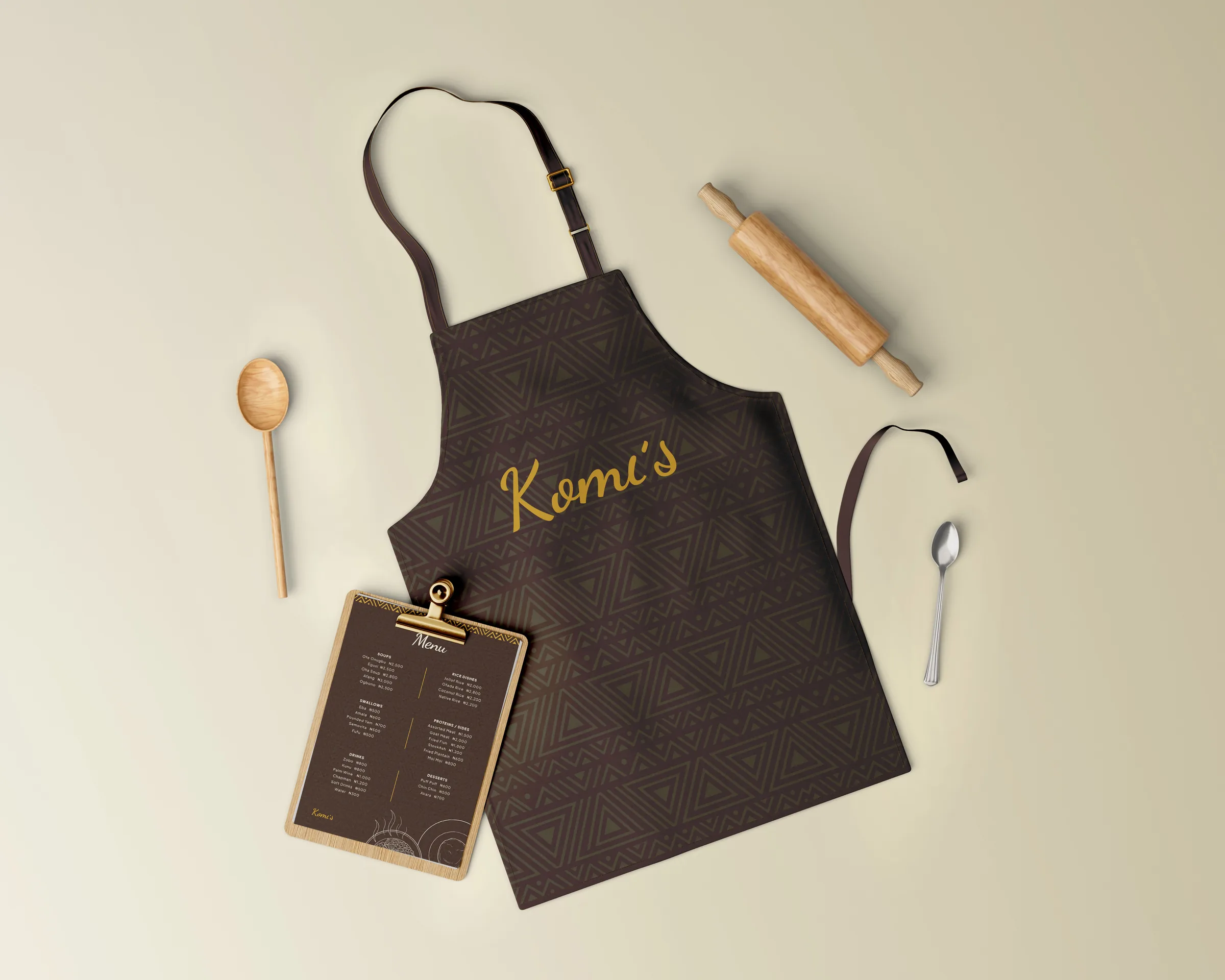
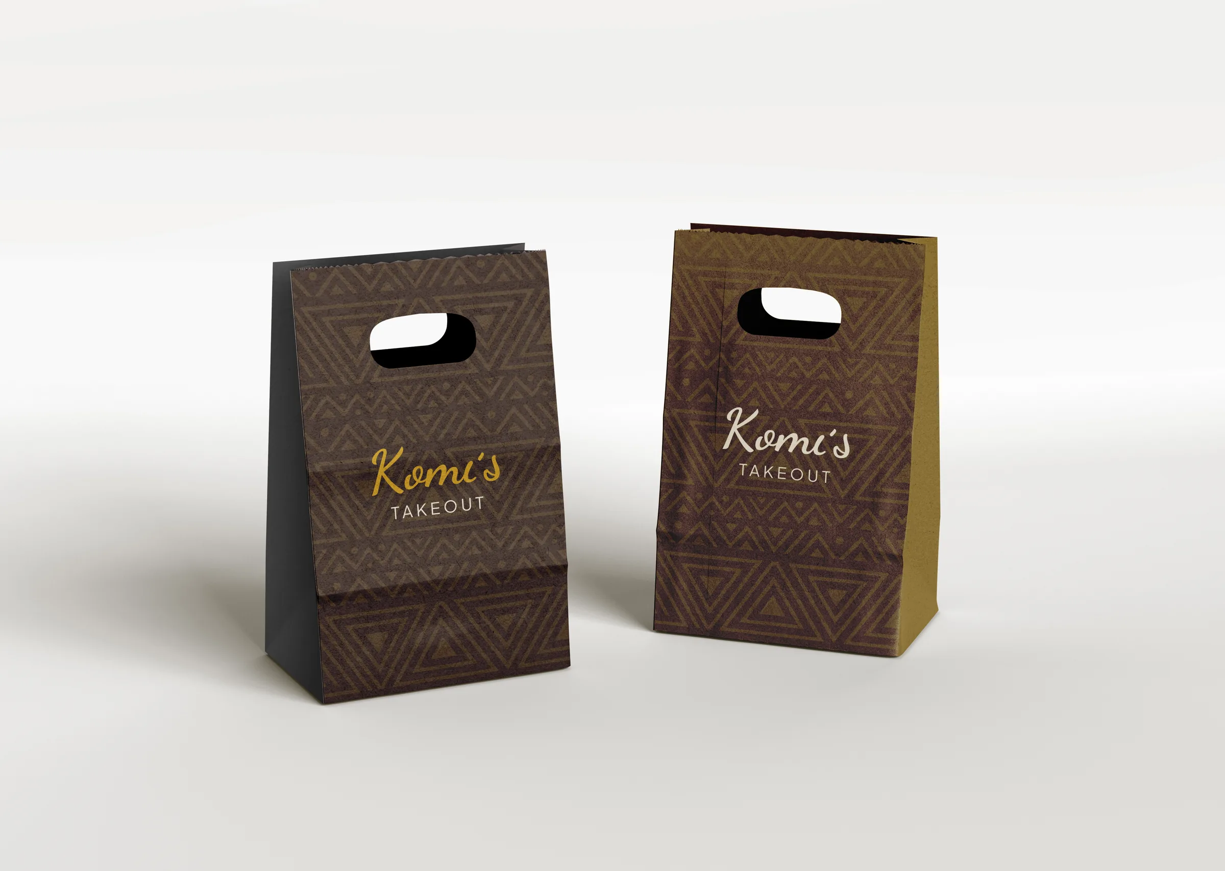
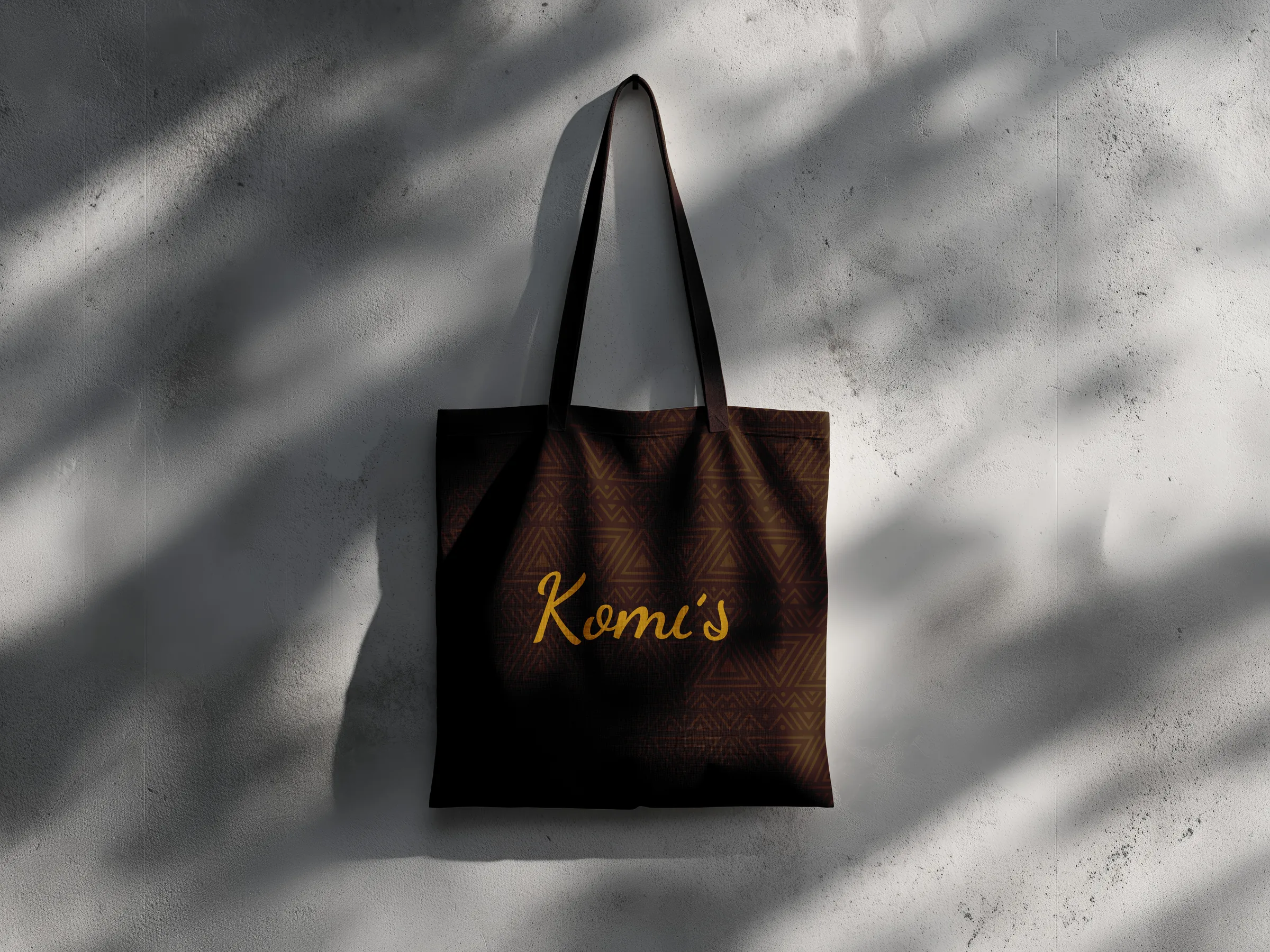
So the mascot wears indigenous attire, to signal home-made. The palette is earthy, deep brown and ochre gold, for a real, down-to-earth first impression, like the calabashes our mothers cooked with. And the wordmark is set in Dancing Script, for the artistic expression that runs through the whole story.
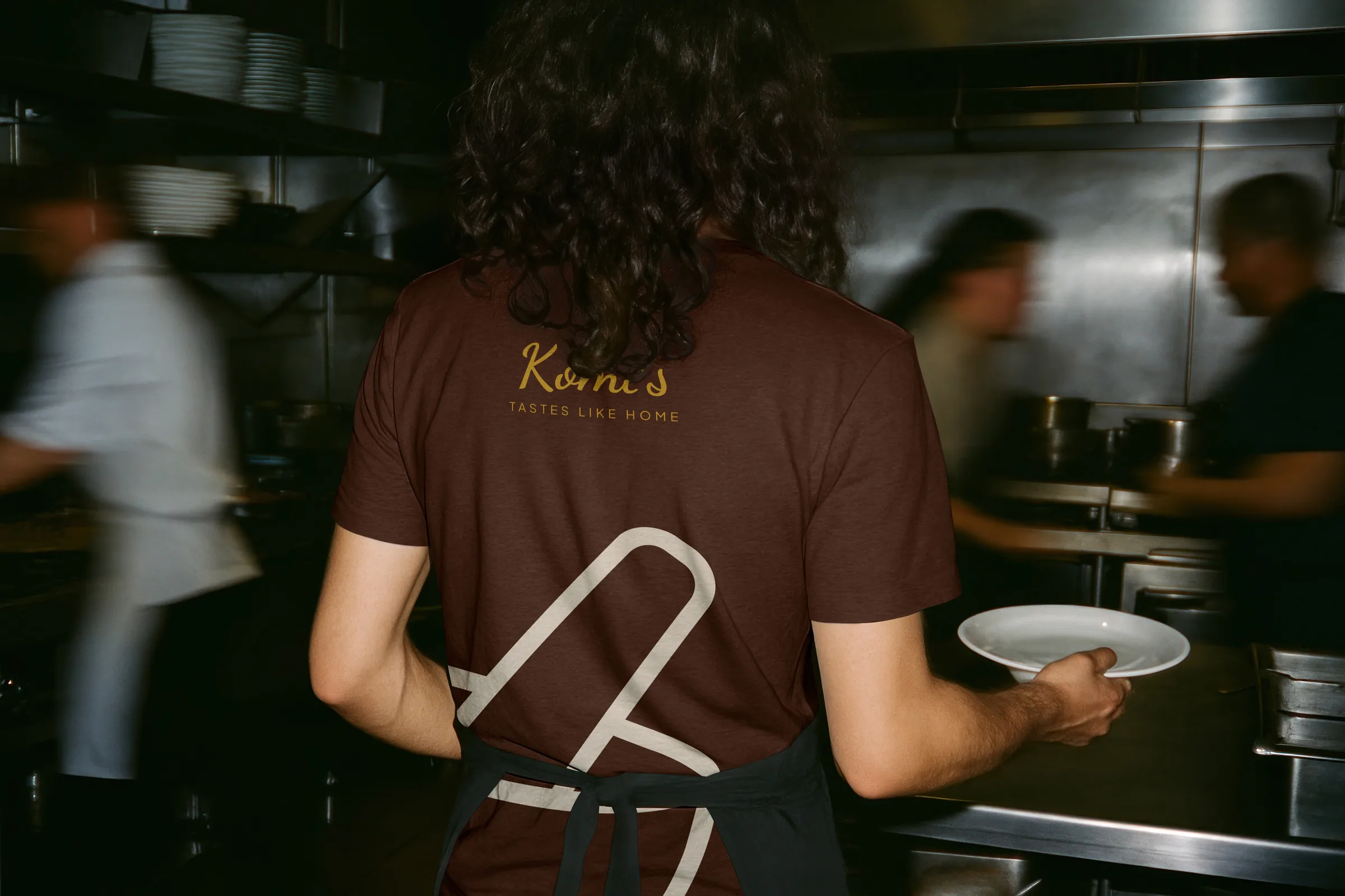
The tagline went through several versions before we settled on “Tastes like home.” It stood out because it held food and heritage in a single phrase. It also helped that it didn’t sound cheesy (at least to us 😅).

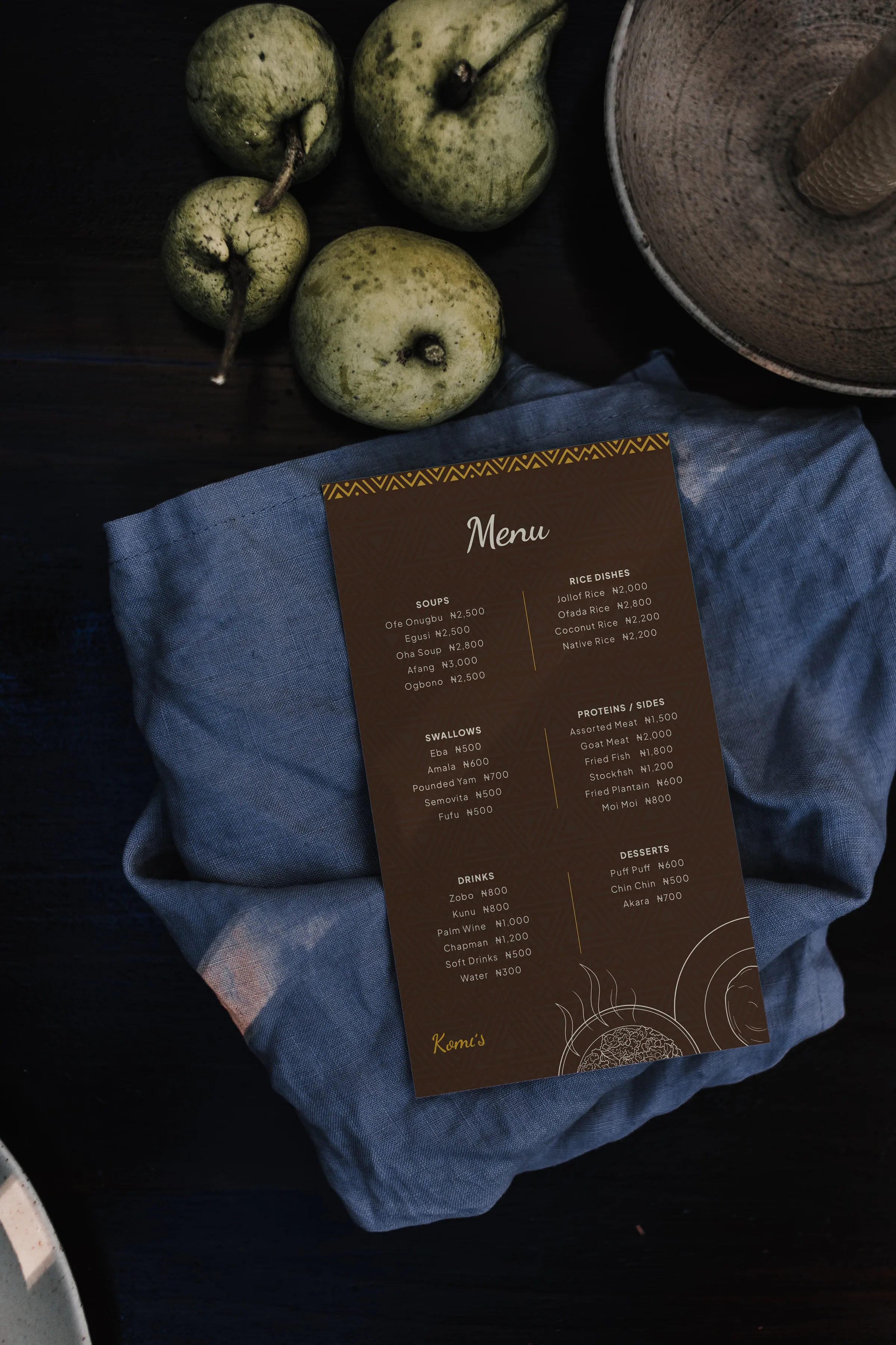
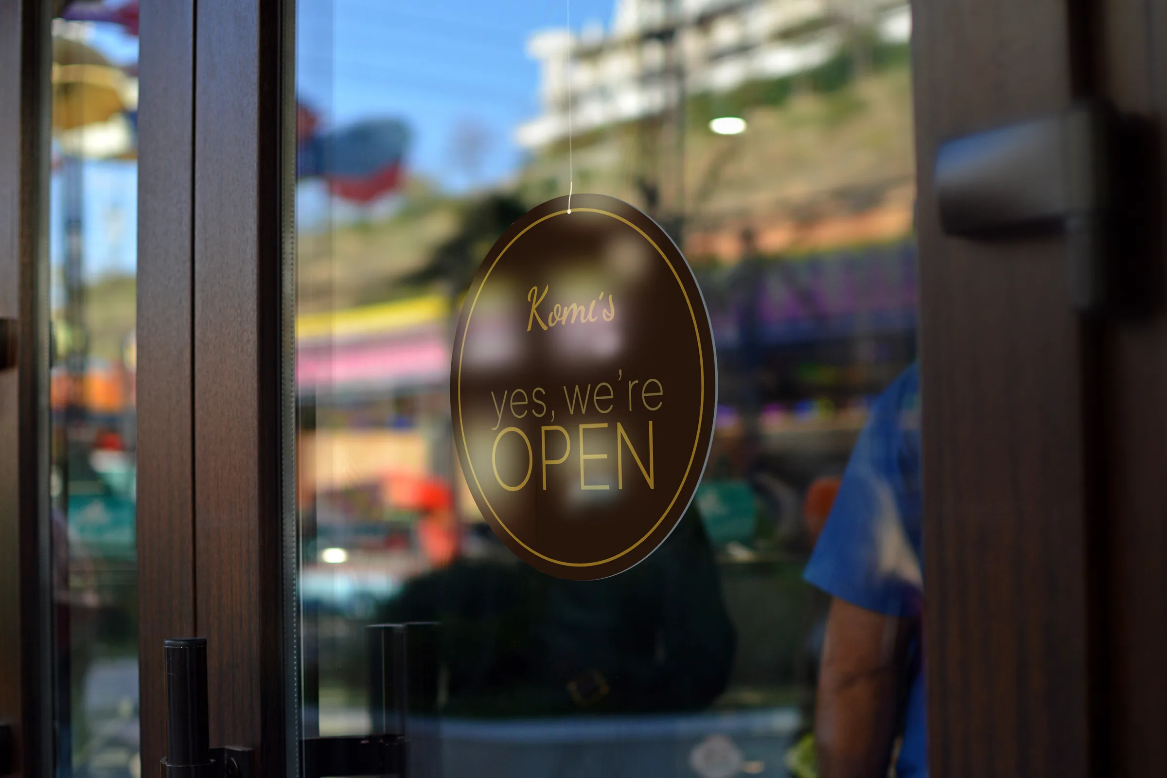
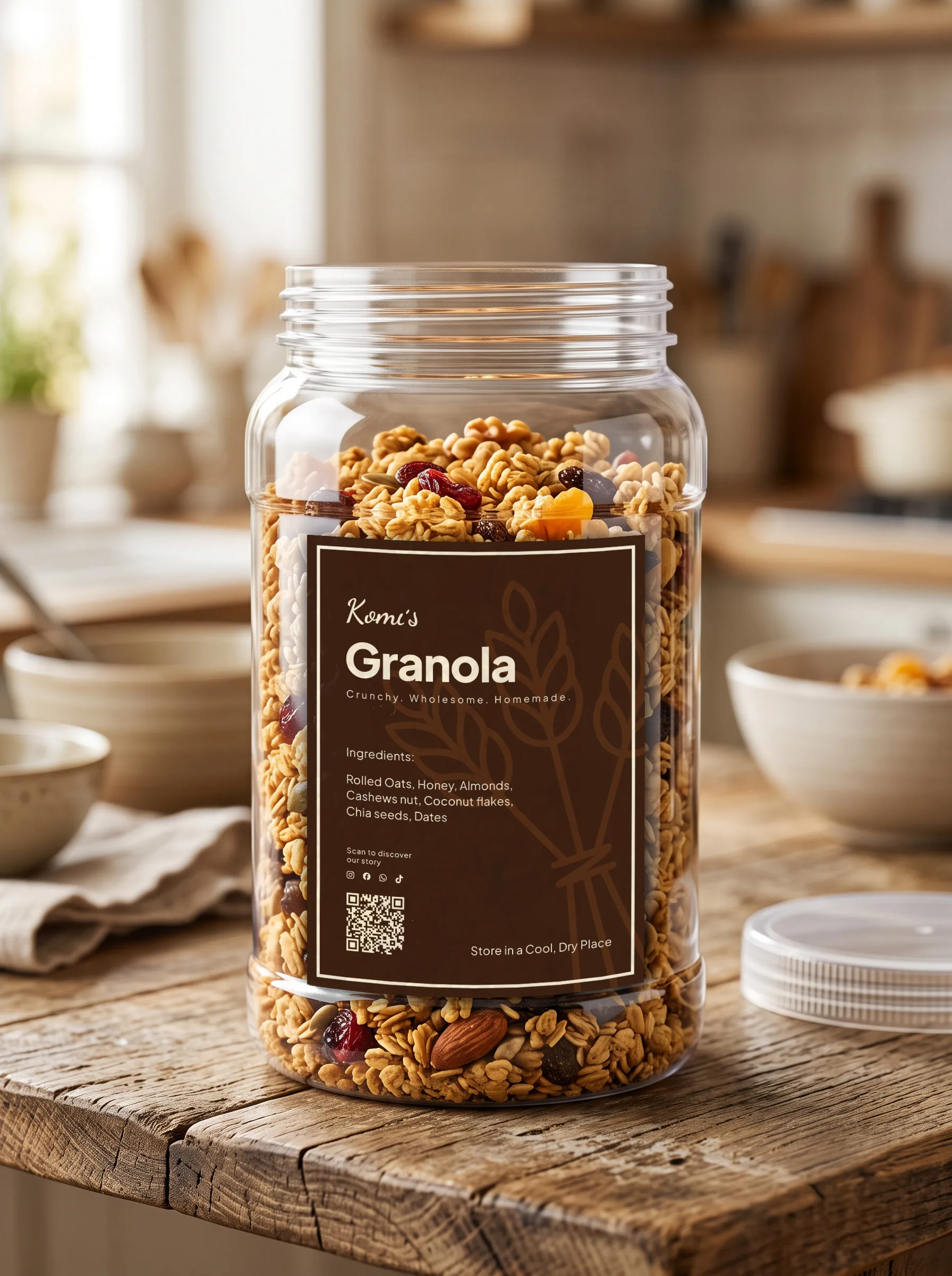
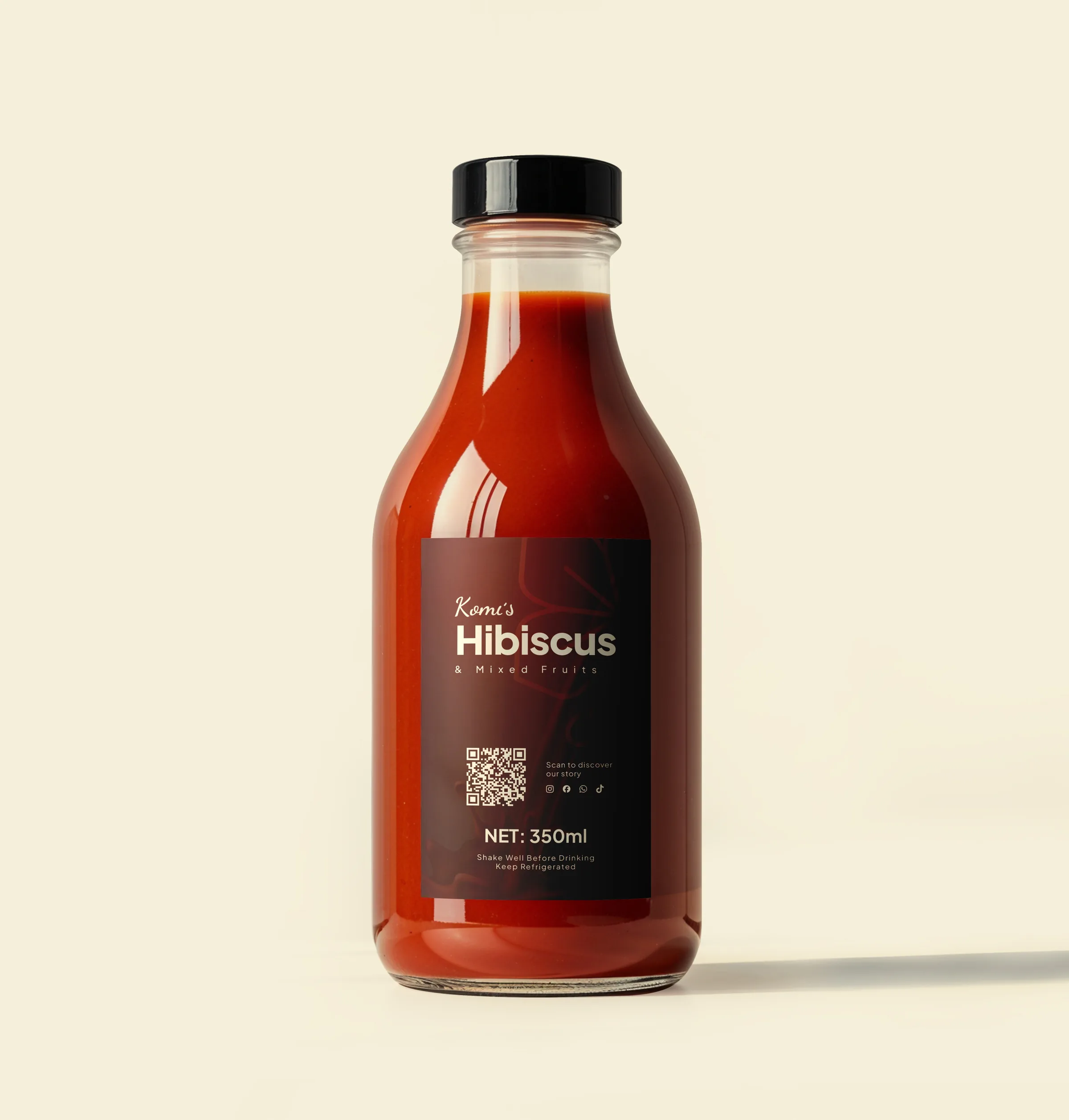
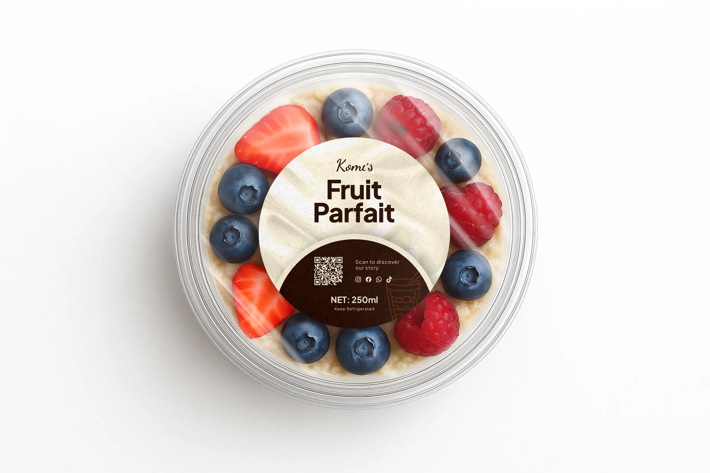
I kept the heritage story off the product labels and let them stay functional. A label has one job at the shelf, and the story lands better where people have time to read it.
“I love how Victor takes his time. Whenever I had a question, he’d explain until I had real clarity on the choices. By the final review, it already looked like an established, launched business.”