Brand Identity · Luxury Real Estate
Joie Luxe Rentals
Brand Identity · Luxury Real Estate
Overview
After my first conversation with Joy Felix, I moved into research, luxury brands within and outside real estate. Rolex. Patek Philippe. Aman. BHS-Marbella. Each one taught me something different about what luxury actually communicates.
Aman stood out most: minimal, quiet, serene photography. Layouts with radical restraint. In one word, luxury. That sensibility became the north star for Joie Luxe.
The mark
All the while I was researching, I was sketching. The first iteration my client didn't entirely accept, and I'm glad she didn't. It forced me back to the sketchbook, deeper into abstraction.
"It was more or less a mistake, but when I saw it, I knew this was it."
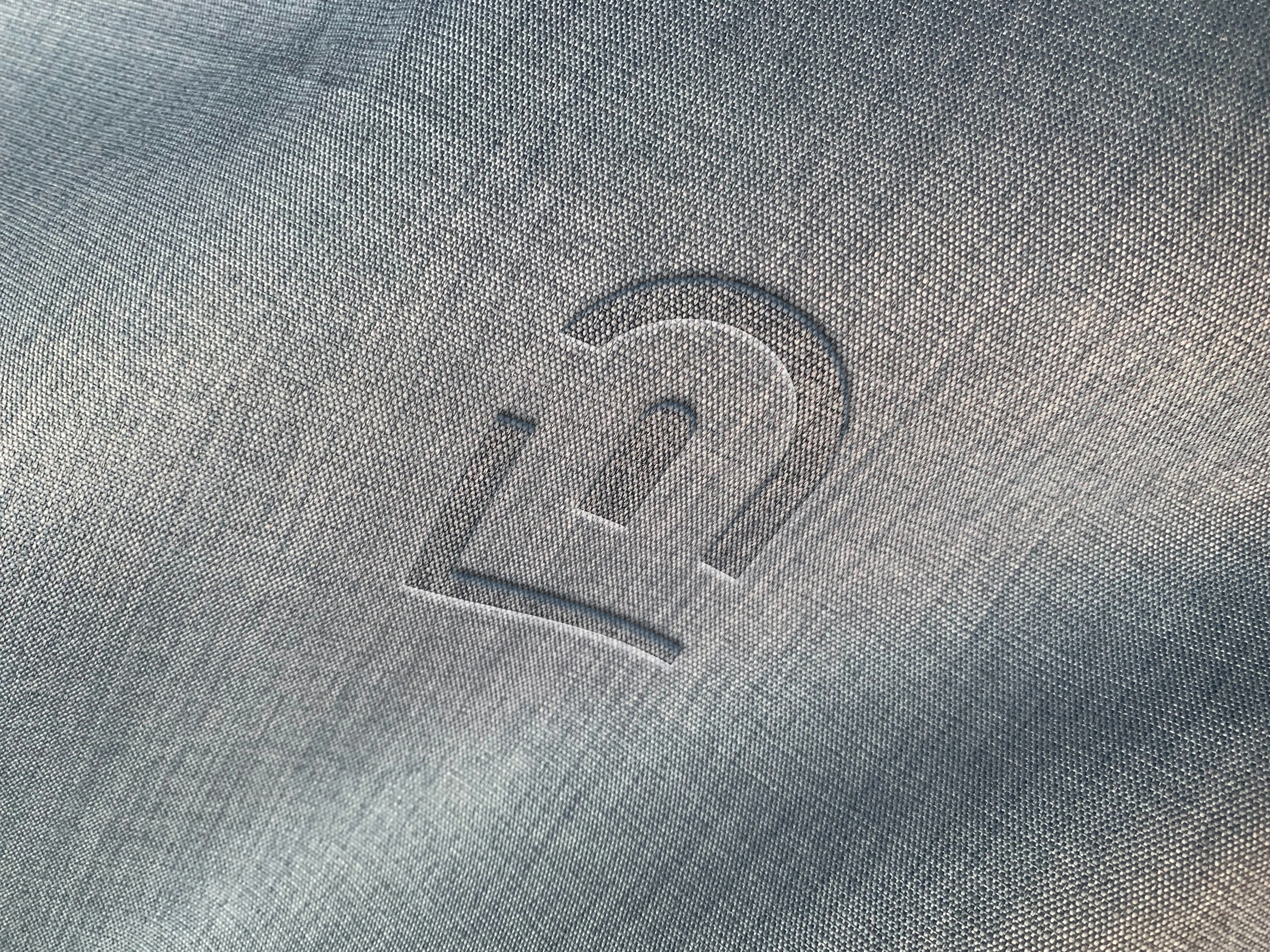
The final mark arrived while experimenting in Illustrator, not by strategy, but by following an instinct. It integrated an arch and the initials J and L. The way they fit together felt less like design and more like discovery. I decided on a typeface that completed it, and my client approved without hesitation.

Brand system
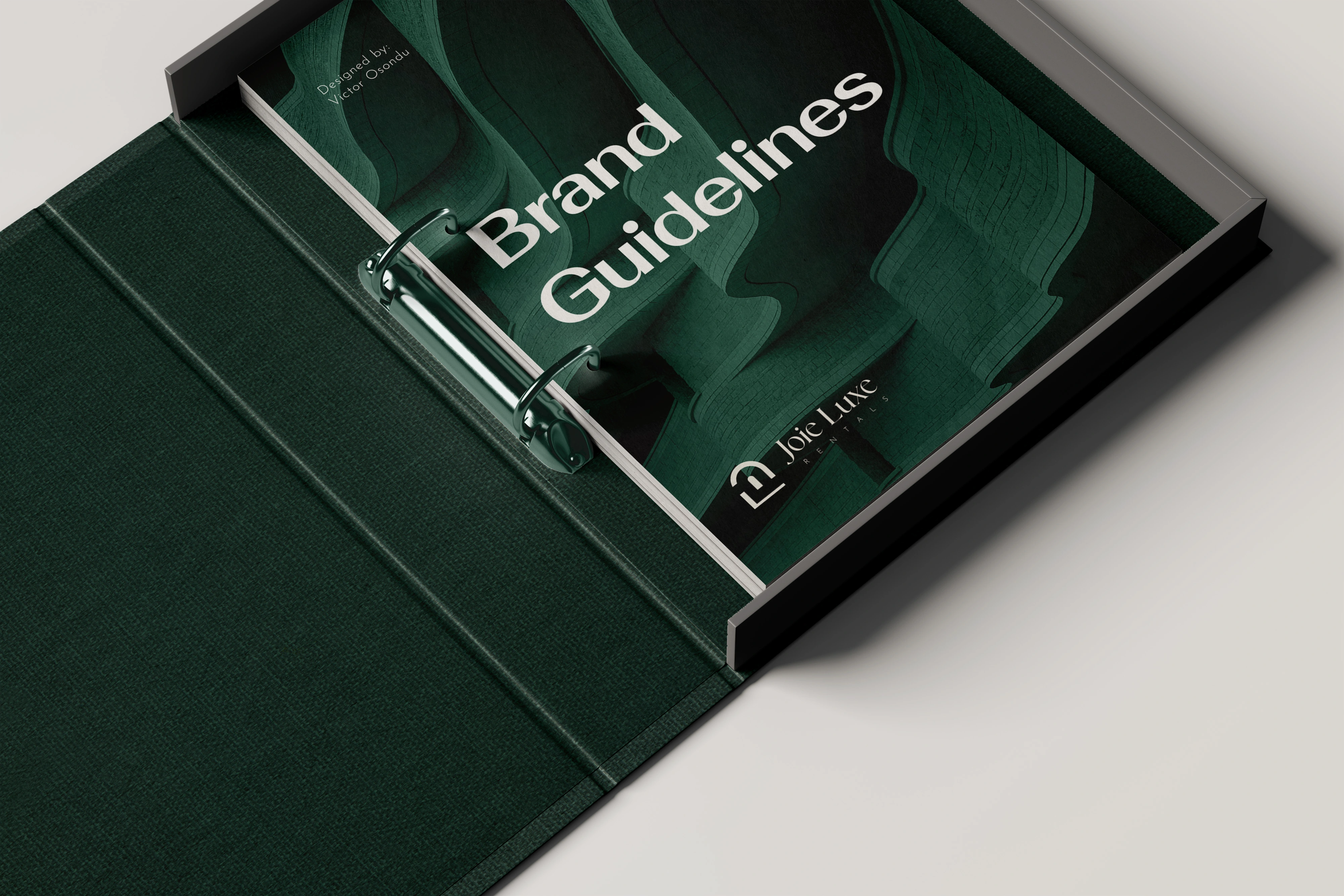
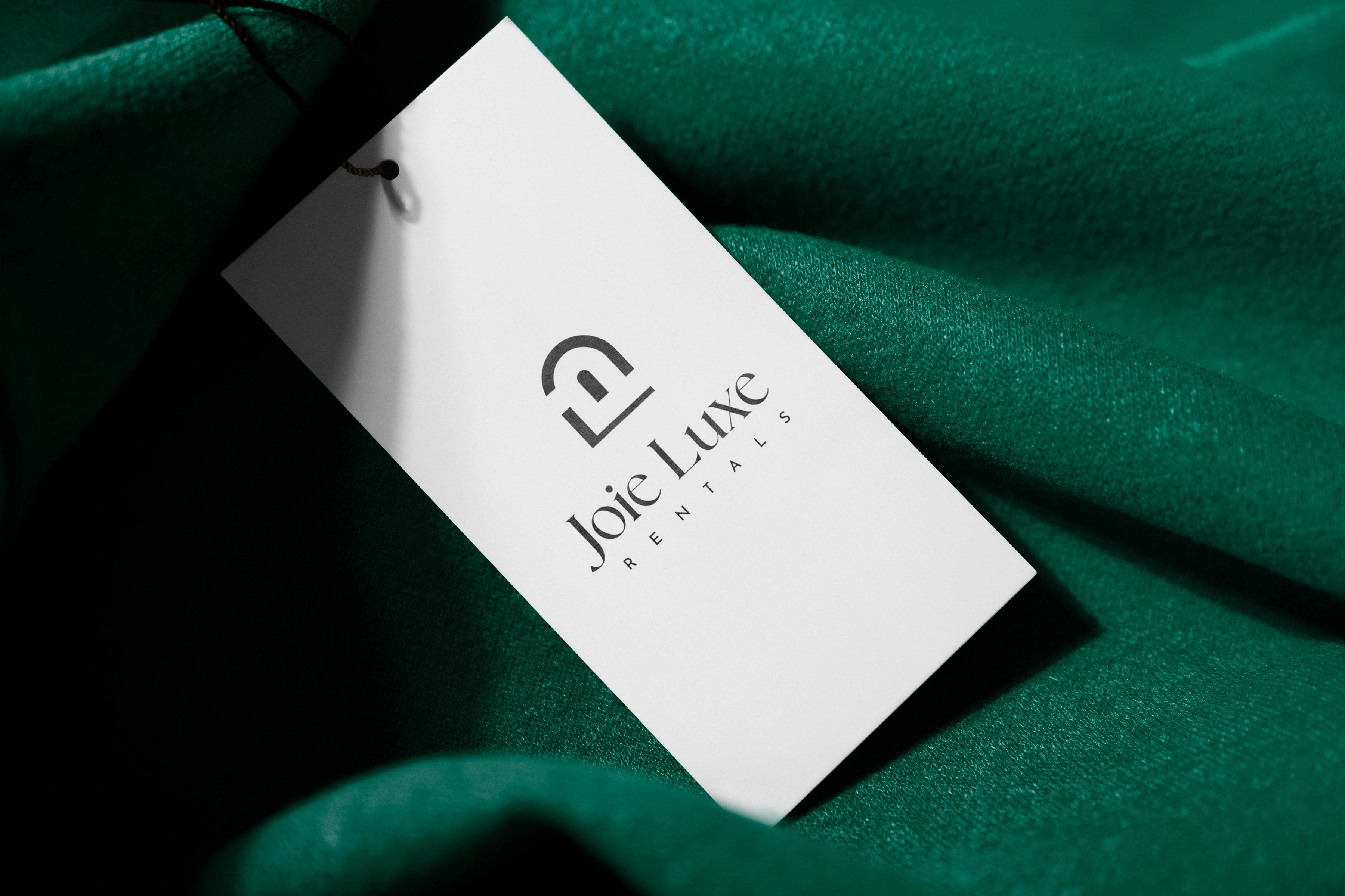
From the mark, the identity expanded outward: colour selection, grid systems, layout principles, and brand guidelines. Deep forest greens against cool whites and warm neutrals, a palette that communicates premium without shouting.
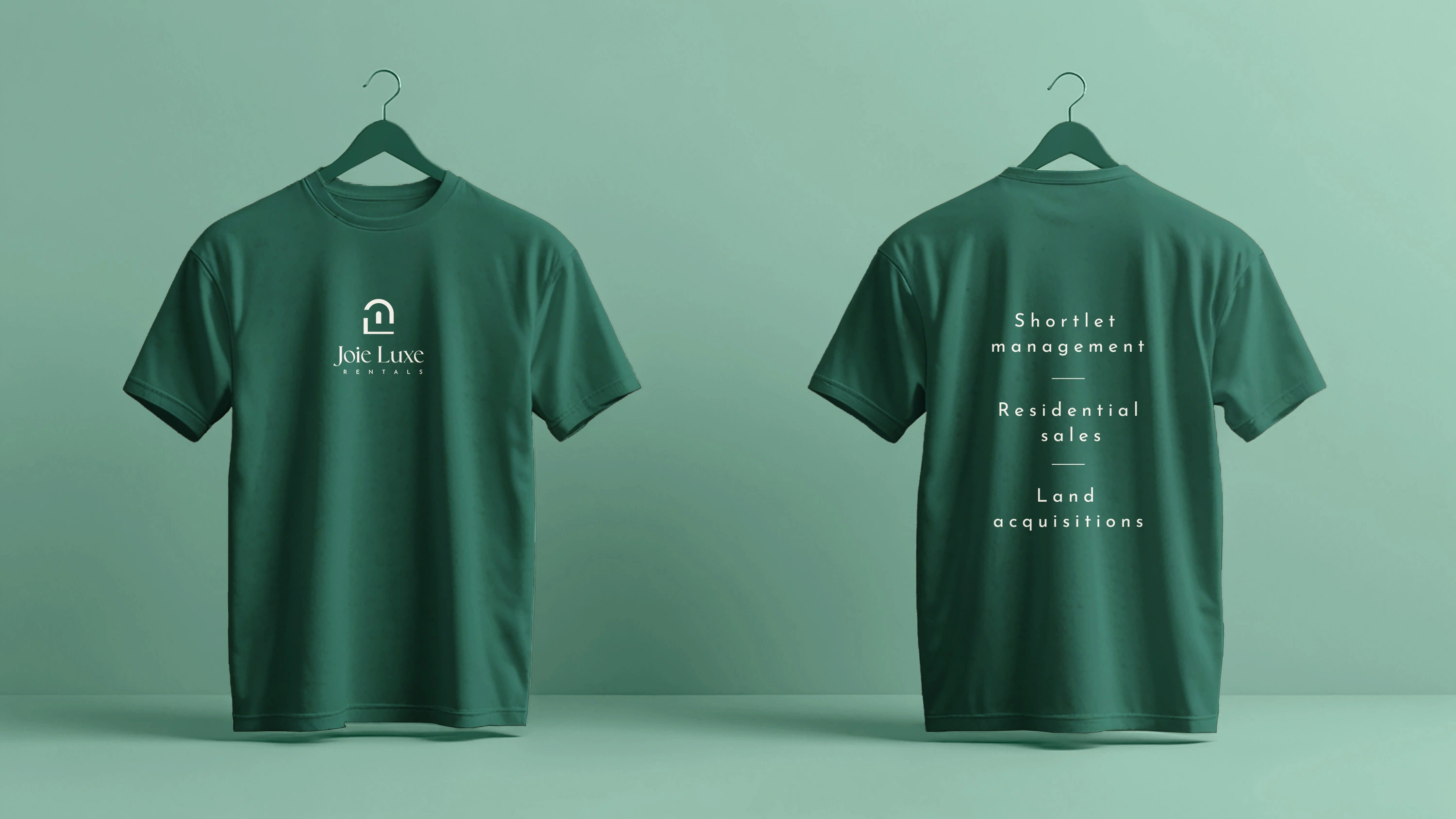
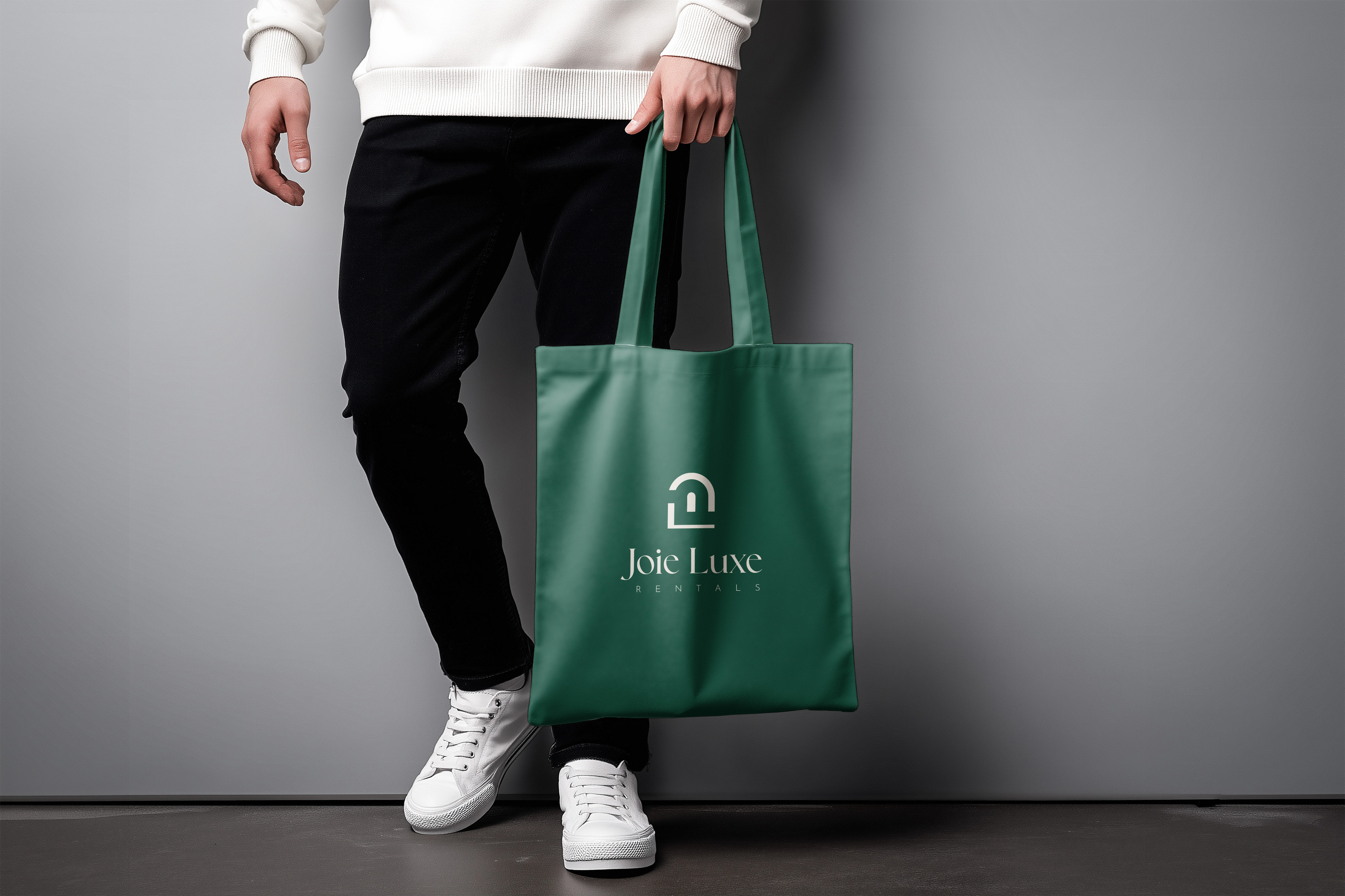
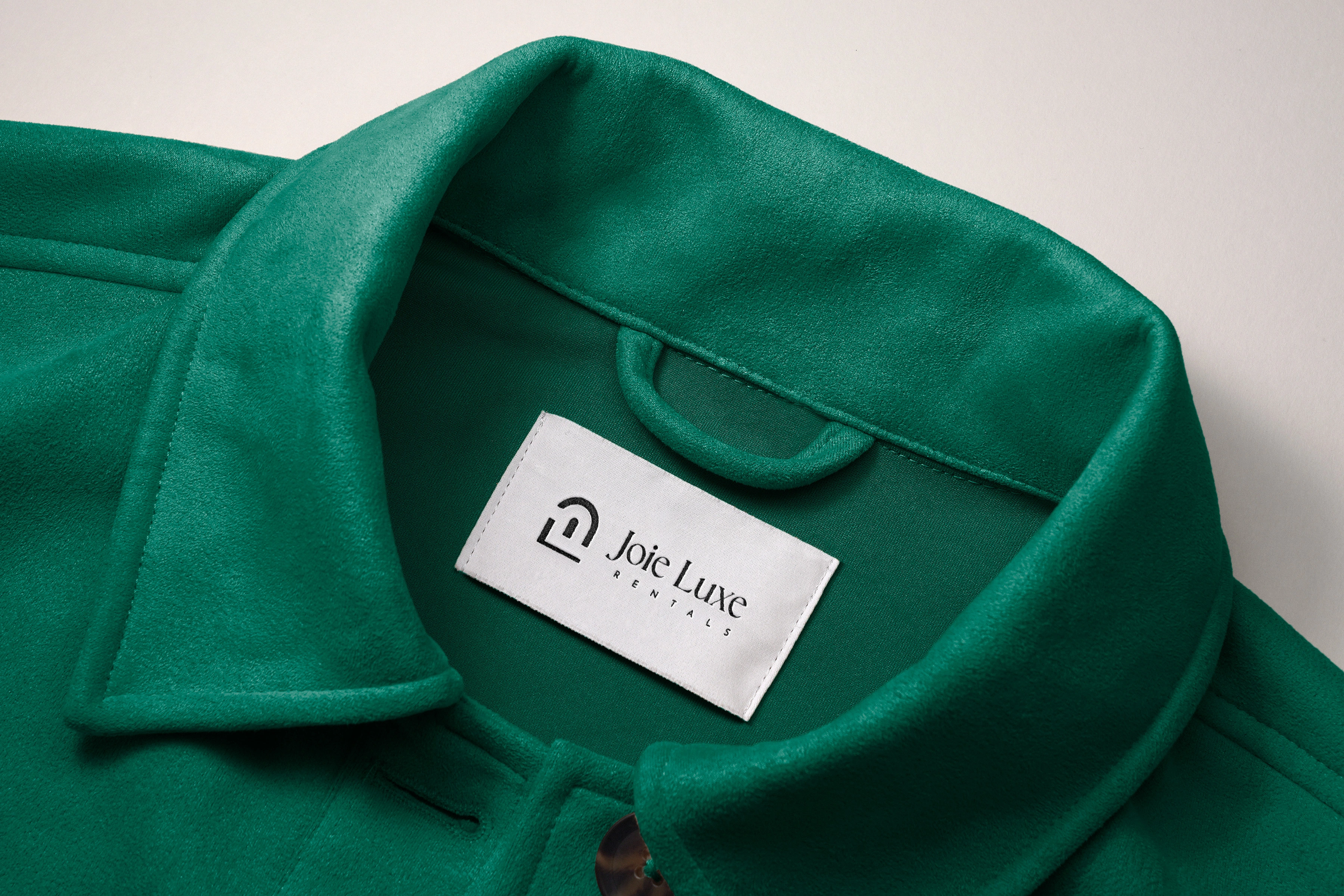
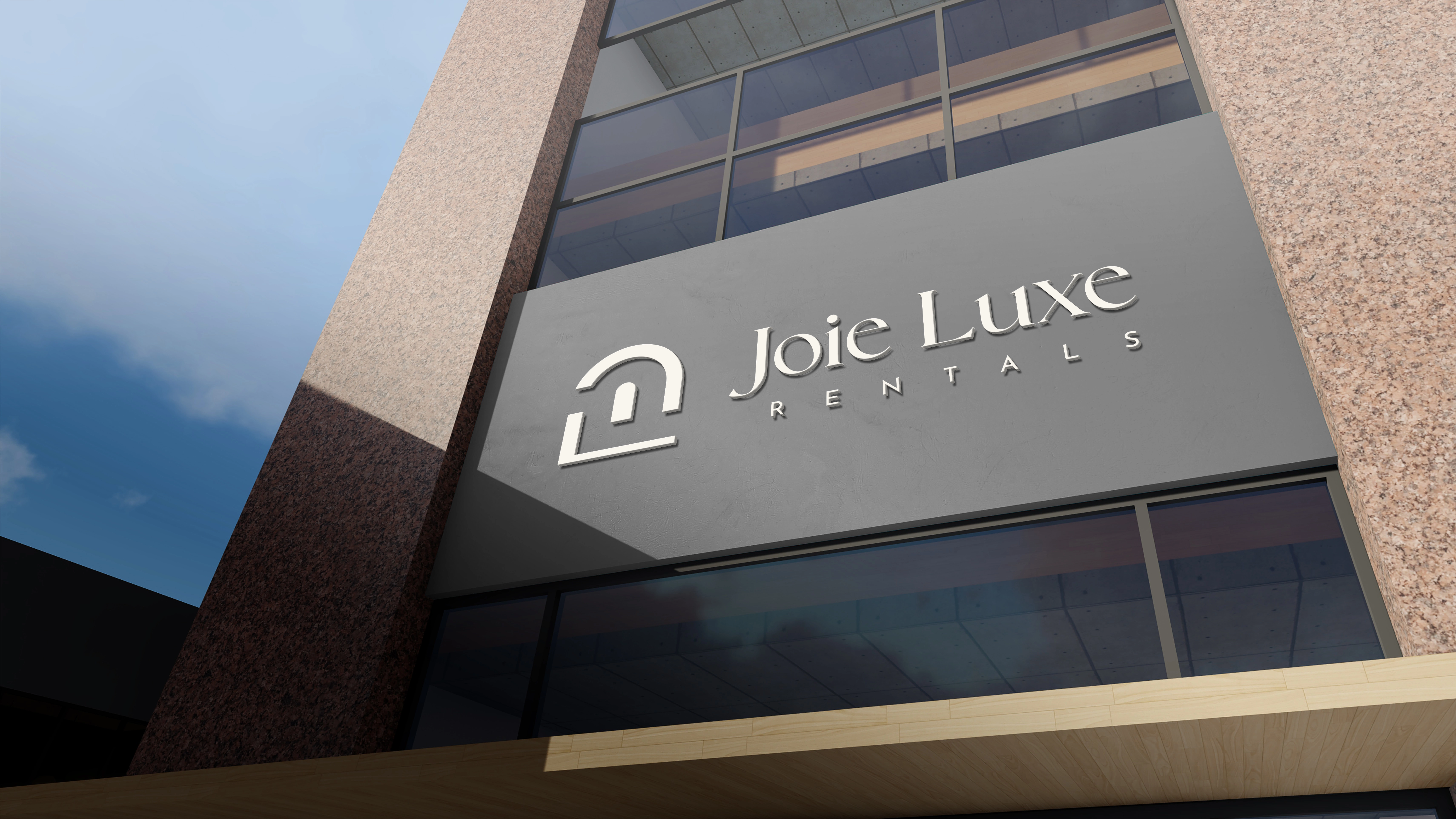
Every element was tested: would it work on a building signage? On a business card? On a tote bag? On a hung clothing tag? The answer had to be yes at every scale.
Collateral
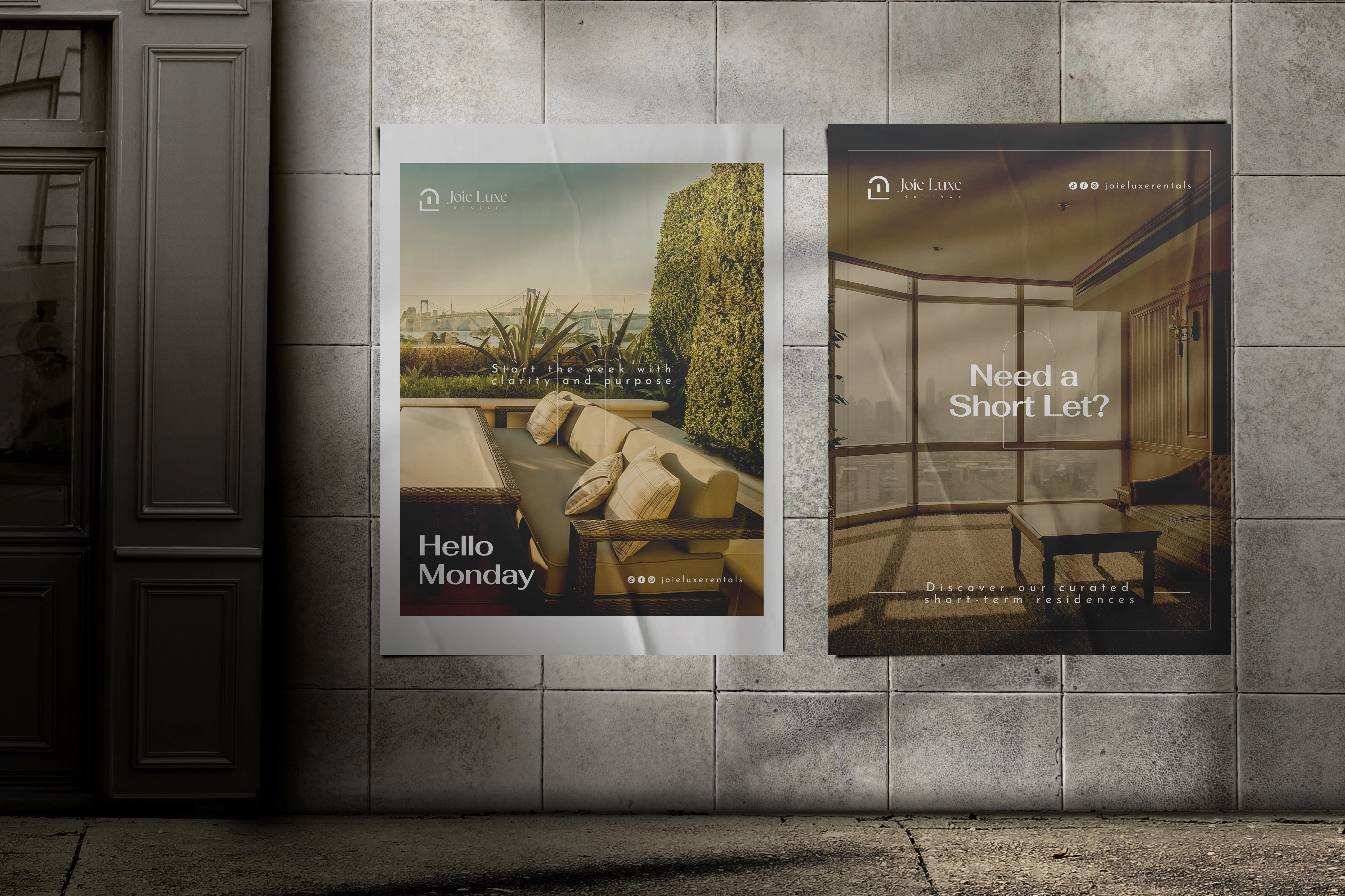
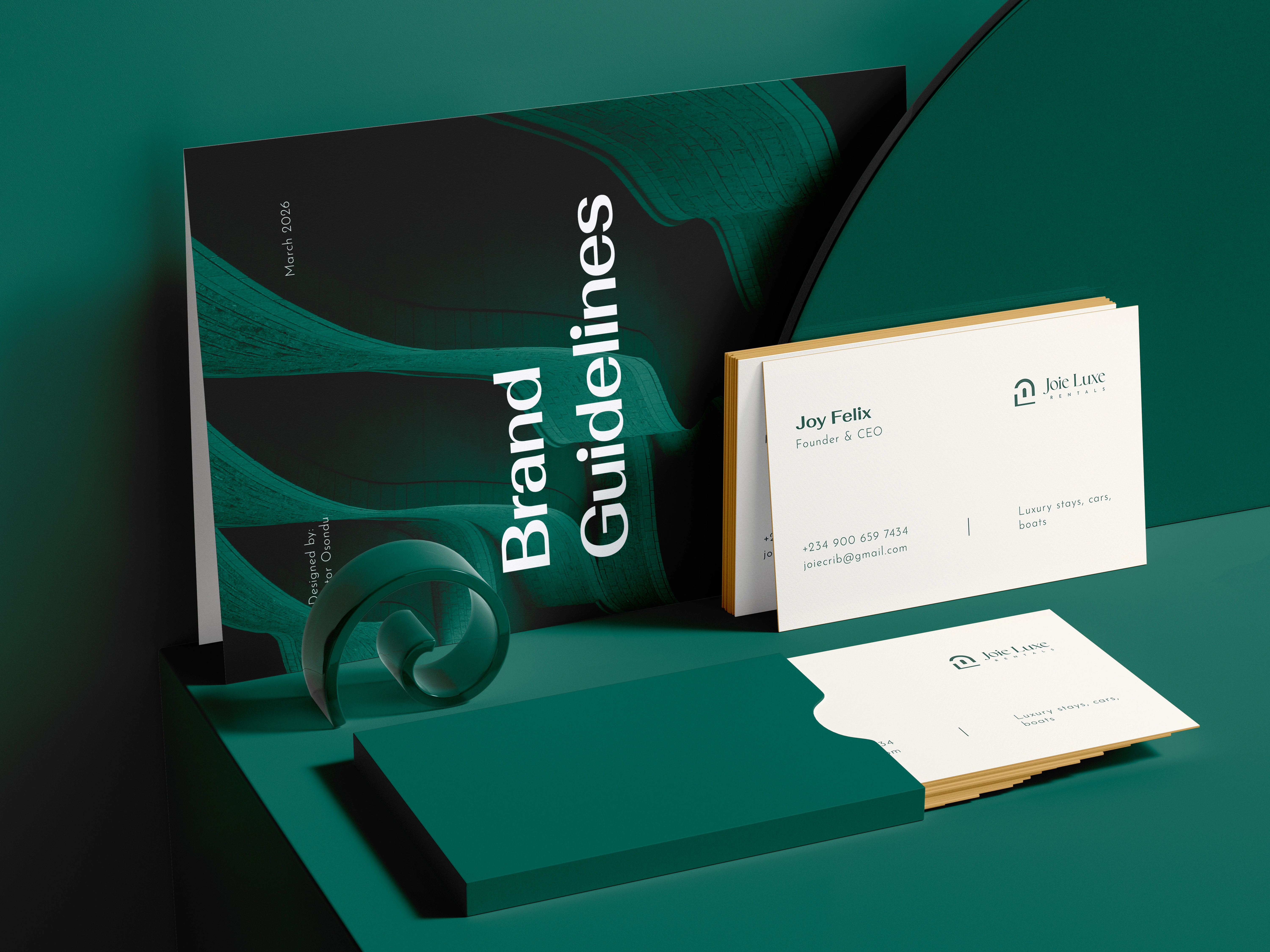
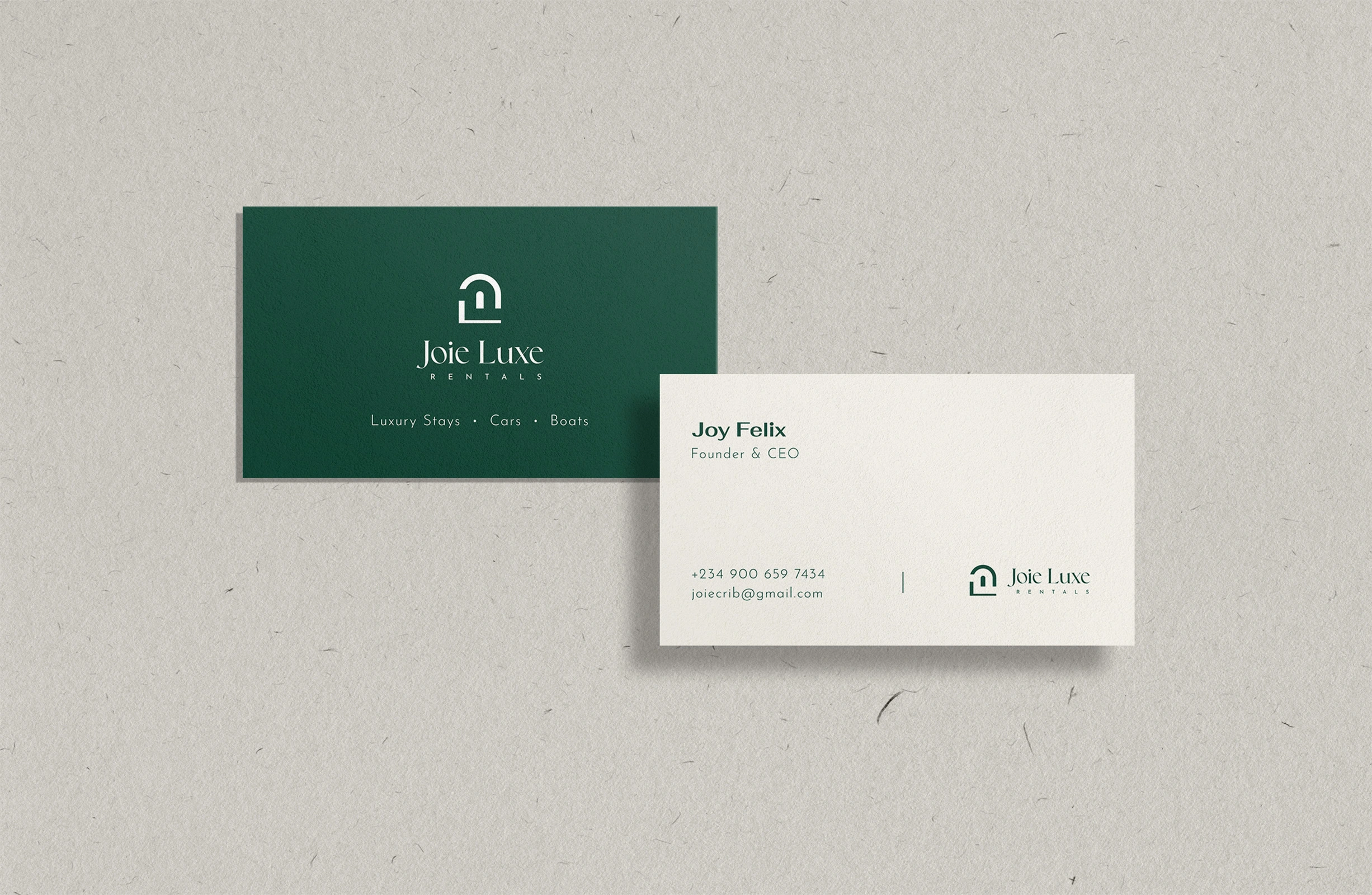
Brand guidelines, business cards, social media designs, a t-shirt, invoice template, all designed within the Joie Luxe identity. Every asset uploaded to Google Drive and delivered to Joy. Then a few minor updates to better suit her evolving needs. Then the balance paid.